A professional basketball team, a weather station, and a scientist studying birds all have something important in common: they collect huge amounts of information and search for patterns. A single number usually does not tell much, but a large set of numbers can reveal something surprising. When students, scientists, and engineers use math carefully, they can turn many measurements into useful explanations and smart decisions.
Math is not only about getting answers. It is also a tool for understanding the world. When we measure rainfall, record plant growth, test how strong a bridge model is, or count how many birds visit a feeder, we create information that can be studied. This kind of work falls under using mathematics and computational thinking, which means using numbers, patterns, and organized steps to make sense of real data.
Patterns help us notice what is happening and what might happen next. If temperatures rise for several days in a row, that is a pattern. If one type of seed grows faster than another in repeated tests, that is a pattern too. A pattern does not have to be perfectly exact. It can be a general trend that helps explain what the data suggests.
Scientists look for patterns because patterns can lead to conclusions. A conclusion is an idea supported by evidence. For example, if a class measures the height of bean plants for two weeks and most plants receiving more sunlight grow taller, students may conclude that more sunlight helps bean plants grow. The conclusion must be based on the data, not just a guess.
Weather forecasts are built from enormous data sets that include temperature, air pressure, wind speed, and moisture. Computers help scientists find patterns much faster than people could by hand.
Patterns also matter when solving problems. Engineers test different designs, collect measurements, and compare results. If one design holds more weight or uses less material, the pattern in the data helps them decide which design works best.
A data set is a collection of information. It may include many measurements, counts, or observations. If a class measures the temperature outside every hour for a week, all of those temperature readings together make a data set.
Each piece of information in a data set is often called a data value. The thing being measured is often called a variable. In a plant experiment, height might be one variable, and amount of water might be another. In a bird study, the variable might be the number of birds seen each day.
Data set means a collection of related information.
Variable means something that can change or be measured, such as height, time, mass, or temperature.
Pattern means a repeated idea or a noticeable relationship in data.
Small data sets might have only a few values, but large data sets can have dozens, hundreds, or even millions of values. As data sets grow larger, it becomes harder to understand them by simply looking at a list of numbers. That is why organization and mathematical representations are so important.
When data is messy, patterns stay hidden. When data is organized, patterns become easier to see. For example, a plant-growth table can arrange measurements by day. A clear table helps students compare values, notice changes, and avoid losing track of information.
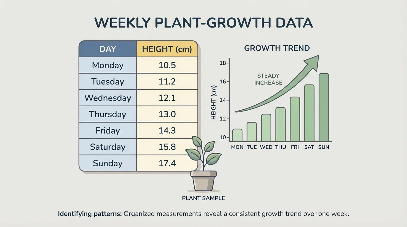
[Figure 1] Suppose a class records a plant's height for five days: Day \(1\): \(4 \textrm{ cm}\), Day \(2\): \(5 \textrm{ cm}\), Day \(3\): \(5 \textrm{ cm}\), Day \(4\): \(7 \textrm{ cm}\), Day \(5\): \(8 \textrm{ cm}\). In a sentence, this is hard to scan quickly. In a table, the increase becomes much clearer.
| Day | Plant Height |
|---|---|
| \(1\) | \(4 \textrm{ cm}\) |
| \(2\) | \(5 \textrm{ cm}\) |
| \(3\) | \(5 \textrm{ cm}\) |
| \(4\) | \(7 \textrm{ cm}\) |
| \(5\) | \(8 \textrm{ cm}\) |
Table 1. Plant height data measured over five days.
Students can organize data by time, size, category, or location. For example, bird sightings can be grouped by species. Rainfall amounts can be listed by date. Test results for bridge designs can be grouped by design name. Organizing data is one of the first steps in computational thinking because it prepares information for careful study.
Sometimes scientists use spreadsheets or computer programs to sort data from least to greatest or place matching categories together. This saves time and reduces mistakes. Even when computers help, people still need to think carefully about what the numbers mean.
After organizing data, the next step is to look for a trend or some other pattern. A trend is the general direction in which data moves. It may move upward, downward, or stay about the same.
If the temperatures over five days are \(18\), \(20\), \(21\), \(23\), and \(24\) \(^{\circ}\textrm{C}\), the trend is upward. If the number of birds at a feeder is \(12\), \(11\), \(12\), \(13\), and \(12\), the data stays close to the same amount. If a value is very far from the others, it may be an unusual value that needs extra attention.
Students should ask questions such as these: Are the values increasing? Are they decreasing? Are some values repeated? Are there groups of similar values? Is there one result that does not fit the rest? These questions help turn a list of numbers into evidence.
Patterns are not always perfect
Real scientific data often has small changes and tiny differences. A pattern does not mean every value matches exactly. If most values point in the same direction, the data may still show a strong relationship. Scientists look for the overall picture, not only one number.
For example, if six plants measured after one week are \(9\), \(10\), \(11\), \(10\), \(12\), and \(30\) centimeters tall, the value \(30\) is much larger than the others. That result may be correct, or it may be a measuring error. Good scientists notice unusual values and investigate them instead of ignoring them.
Large collections of numbers become easier to understand when we use mathematical representations. These are ways to show data clearly using tables, graphs, symbols, and calculations. The same set of measurements can look very different in a bar graph and a line graph, and each graph highlights a different feature of the data.
[Figure 2] A table is useful when exact values matter. A bar graph is helpful when comparing categories, such as how many students prefer apples, bananas, or oranges. A line graph is especially useful when data changes over time, such as hourly temperature or daily plant growth.
Suppose the temperature for four days is \(15\), \(17\), \(19\), and \(18\) \(^{\circ}\textrm{C}\). A line graph makes it easy to see the rise from Day \(1\) to Day \(3\), followed by a small drop on Day \(4\). A bar graph can also show the data, but the line graph emphasizes change over time more clearly.
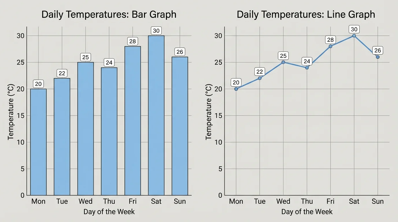
Labels matter in every representation. A graph needs a title, names for the axes, and a clear scale. If the scale is confusing, the graph can make the pattern look bigger or smaller than it really is. Careful labeling makes explanations more trustworthy.
Later, when students compare results from an investigation, they can return to [Figure 2] and remember that the best representation depends on the question being asked. If the goal is to compare categories, bars work well. If the goal is to study change over time, a line graph is often better.
Graphs help us see patterns, but calculations help us describe them more exactly. Students can add values to find a total, subtract to find change, compare by difference, and use averages to describe a typical result.
One important average is the mean. The mean is found by adding all the values and dividing by how many values there are. If the number of ladybugs seen in four garden sections is \(6\), \(8\), \(10\), and \(12\), then the mean is
\[\frac{6+8+10+12}{4}=\frac{36}{4}=9\]
So the mean number of ladybugs is \(9\).
Another useful number is the range. The range tells how spread out the data is. It is found by subtracting the smallest value from the largest value. For the same ladybug data, the range is \(12-6=6\).
To find a mean, first add the data values, then divide by the number of values. To find a range, subtract the smallest value from the largest value.
These numbers help students make stronger explanations. Saying "the plants grew" is vague. Saying "the mean growth was \(3 \textrm{ cm}\) and the tallest plant was \(5 \textrm{ cm}\) taller than the shortest" is much more informative.
Science uses evidence, and math helps make that evidence clear. If students test whether plants grow better in sunlight or shade, they should compare measurements, not just opinions. They might calculate the mean height for each group, compare the ranges, and study the graph to see the trend.
Suppose four plants in sunlight have heights of \(12\), \(13\), \(11\), and \(14\) centimeters, while four plants in shade have heights of \(8\), \(9\), \(7\), and \(8\) centimeters. The sunlight group has mean \(\dfrac{12+13+11+14}{4}=\dfrac{50}{4}=12.5\), and the shade group has mean \(\dfrac{8+9+7+8}{4}=\dfrac{32}{4}=8\). Since \(12.5 > 8\), the data supports the conclusion that the sunlight plants grew taller in this test.
A strong scientific explanation often follows this pattern: state the claim, give the evidence, and explain the reasoning. For example: "Plants in sunlight grew taller. The mean height in sunlight was \(12.5 \textrm{ cm}\), while the mean height in shade was \(8 \textrm{ cm}\). This suggests that sunlight helped the plants grow more in this investigation."
"Evidence is stronger when it is measured, organized, and explained clearly."
Students should use careful words like suggests, supports, or shows in this test. One data set can provide strong evidence, but scientists also know that repeating tests makes conclusions more reliable.
[Figure 3] Math is also used when people create solutions to problems. Engineers often build several designs, test them, and compare the results. The data helps them choose the best design by showing how much mass different paper bridge models can support. Without measurement, it would be hard to know which design truly works better.
Suppose three paper bridge designs are tested. Design A supports \(200 \textrm{ g}\), Design B supports \(260 \textrm{ g}\), and Design C supports \(240 \textrm{ g}\). If the goal is to support the greatest mass, Design B is best because \(260 > 240 > 200\). If another goal is to use the least paper, students may need more data before deciding.
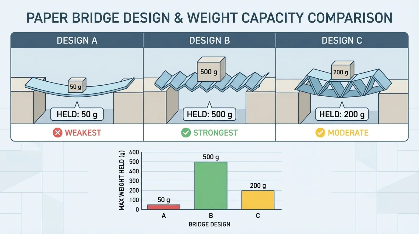
Good design decisions are based on clear criteria. A criterion is a rule for success. One criterion might be "hold at least \(250 \textrm{ g}\)." Another might be "use no more than \(2\) sheets of paper." Math helps compare the designs to the criteria.
Later, when students evaluate a new design challenge, they can think back to [Figure 3] and remember that numbers make decisions fairer. Instead of choosing a favorite design by appearance, they can choose by evidence.
The best way to understand these ideas is to see how the calculations and reasoning work step by step.
Worked example 1: Finding a mean from a data set
A class records the number of butterflies seen in five minutes on four different days: \(7\), \(9\), \(6\), and \(10\).
Step 1: Add the values.
\(7+9+6+10=32\)
Step 2: Count how many values there are.
There are \(4\) values.
Step 3: Divide the total by the number of values.
\(\dfrac{32}{4}=8\)
The mean number of butterflies is \(8\).
This mean gives a typical number of butterflies for those observations. It is more useful than looking at only one day.
Worked example 2: Finding the range
A student measures the lengths of four leaves: \(9 \textrm{ cm}\), \(12 \textrm{ cm}\), \(11 \textrm{ cm}\), and \(15 \textrm{ cm}\).
Step 1: Identify the largest and smallest values.
Largest value: \(15\). Smallest value: \(9\).
Step 2: Subtract the smallest from the largest.
\(15-9=6\)
The range is \(6 \textrm{ cm}\).
A larger range means the data is more spread out. A smaller range means the values are closer together.
Worked example 3: Comparing two groups to support a conclusion
Two kinds of paper towel are tested by measuring how much water each can absorb. Brand X absorbs \(14\), \(15\), and \(13\) milliliters. Brand Y absorbs \(10\), \(11\), and \(9\) milliliters.
Step 1: Find the mean for Brand X.
\(14+15+13=42\), and \(\dfrac{42}{3}=14\).
Step 2: Find the mean for Brand Y.
\(10+11+9=30\), and \(\dfrac{30}{3}=10\).
Step 3: Compare the means.
\(14>10\)
Brand X absorbed more water on average, so the data supports the conclusion that Brand X performs better in this test.
Notice that each example does more than calculate. It also explains what the numbers mean. That is the heart of using math to support scientific explanations.
Many jobs depend on finding patterns in large data sets. Meteorologists study weather data. Doctors and health scientists study growth, heart rate, and other measurements. Engineers test materials and compare results. Farmers track rainfall and plant growth. City planners count traffic to decide where roads need improvement.
Students already see data in everyday life. Sports teams compare scores and shooting percentages. Music apps count favorite songs. Video games track points, time, and levels. School lunch staff may count how many meals are chosen each day to plan what food to prepare. In all these cases, math helps people make better decisions.
Computational thinking in simple terms
Computational thinking means solving a problem in an organized way. It includes collecting data, sorting it, looking for patterns, and using clear steps to reach an answer. Computers can help with very large data sets, but the thinking process begins with people asking good questions.
Even when computers create graphs or sort information, humans still decide what to measure, what question to ask, and whether the evidence is strong enough. Technology is helpful, but careful reasoning remains essential.
Not every conclusion is trustworthy. If only one measurement is taken, the data may not be enough. If tools are used incorrectly, the data may be inaccurate. If students compare two groups that were not tested fairly, the conclusion may be weak.
For example, if one plant gets more sunlight and more water, then it is hard to know which variable caused the greater growth. To make a fair test, students should change one variable at a time. Then the patterns are easier to interpret.
Students should also watch for errors in recording. If a thermometer is read incorrectly or a graph is labeled badly, the mathematical representation may mislead the reader. Accurate data and clear math go together.
When a result looks unusual, students should ask whether it is an error, a special case, or an important clue. Good scientists do not throw away results just because they are surprising. They investigate them.