A class measures the length of shadows on the playground three times in one day. In the morning the shadows are long, at noon they are short, and later they grow long again. This is not random. It is a phenomenon—something that happens in the world that we can notice and study. Scientists and students make sense of such changes by collecting data and thinking about it carefully.
When we analyze and interpret data, we do more than read numbers. We ask, "What do these numbers tell us?" We compare results, look for patterns, and use logical reasoning to explain what may be happening. Logical reasoning means using facts and evidence to reach a reasonable conclusion.
Data helps us understand many things we see every day: which plants grow faster, when birds visit a feeder, how weather changes, or which surface makes a toy car roll farther. Good thinkers do not just say, "I think so." They say, "The data shows this, so a careful explanation is supported by evidence." That is how evidence turns observations into understanding.
People often notice events before they understand them. You may see that puddles disappear after rain, that some seeds sprout sooner than others, or that the classroom feels warmer when sunlight shines through the windows. These are all things that can be studied with data.
Data is useful because it helps us move from guessing to explaining. If one student says, "Plants by the window grow better," that is just an idea. If the class measures plant heights for two weeks and finds that window plants grew from \(6 \textrm{ cm}\) to \(14 \textrm{ cm}\) while plants in a darker spot grew from \(6 \textrm{ cm}\) to \(9 \textrm{ cm}\), the explanation becomes stronger. The measurements are evidence.
Data is information we collect, such as counts, measurements, or observations.
A phenomenon is something that happens in nature or in the world that we can notice and try to explain.
Observation is something we notice using our senses or tools.
Measurement is information found by using tools and units, such as \(5 \textrm{ cm}\), \(12 \textrm{ s}\), or \(20^\circ \textrm{C}\).
Sometimes data is made of numbers, and sometimes it is made of descriptions. A note like "the caterpillar stayed still" is also a piece of data. Both numbers and words can help us understand a phenomenon when we organize and think about them clearly.
When students study a phenomenon, they begin by asking questions. Why do ice cubes melt faster in one place than another? Why do some objects sink while others float? Why do certain days have more wind? Questions lead to observations, and observations lead to data.
Not all data looks the same. Some data is about how many, like counting \(12\) ladybugs on one leaf and \(4\) on another. Some data is about how much, like measuring a plant at \(11 \textrm{ cm}\). Some data is about what happened, like recording that a bean seed cracked open on day \(3\).
Once we collect data, we do two big jobs. First, we analyze it, which means we examine it carefully. Second, we interpret it, which means we explain what it may mean. These two jobs work together. Looking carefully comes first; explaining comes next.
One common type is observation data. This includes what we see, hear, or notice, such as "the water turned cloudy" or "the bird landed at \(8{:}15\)." Another common type is measurement data. This includes length, mass, time, temperature, and volume.
Count data tells how many. For example, a student may count \(9\) worms in wet soil and \(3\) worms in dry soil. Time data helps us study change. If a flower opens at \(9{:}00\) and closes by \(5{:}00\), the times can reveal a pattern.
Data can also be grouped into categories. Suppose a class surveys favorite fruits and records apples, bananas, grapes, and oranges. These are categories, not measurements, but they still help us compare results.
| Type of data | Example | What it helps us learn |
|---|---|---|
| Count | \(7\) birds at the feeder | How many there are |
| Measurement | \(15 \textrm{ cm}\) plant height | How much or how big |
| Time | Rain started at \(2{:}10\) | When something happened |
| Category | Cloudy, sunny, windy | Which group it belongs to |
| Description | Leaf edges turned brown | What it looked like or did |
Table 1. Different kinds of data and what each kind helps students understand.
Strong investigations often use more than one kind of data. A weather study might include temperature measurements, cloud descriptions, and counts of rainy days. Using different kinds of evidence gives a fuller picture.
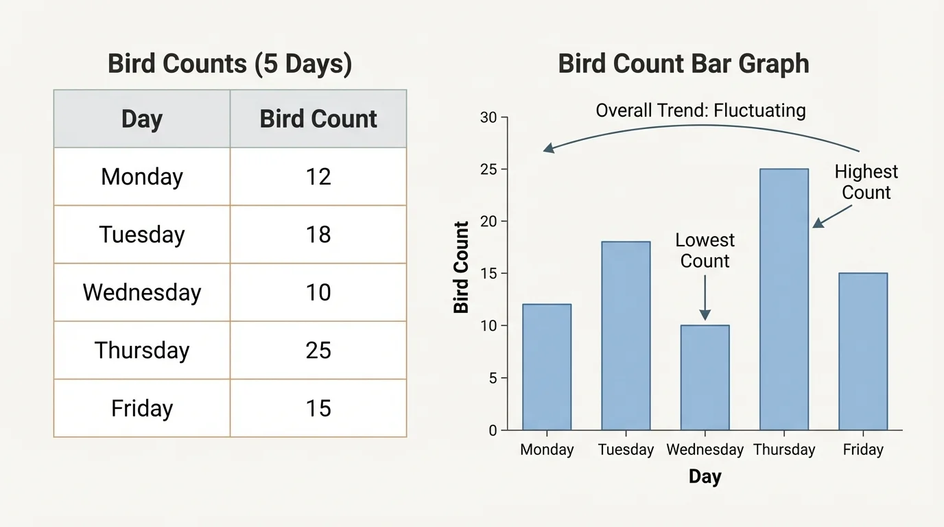
Data can be messy at first. Notes may be scattered, numbers may be out of order, and it may be hard to compare one day with another. As [Figure 1] shows, sorting information into a table or graph makes patterns easier to see when daily counts are arranged from day to day instead of being kept as random notes.
A simple table is often the best starting point. If a class counts birds at a feeder for \(5\) days, they might record \(2, 4, 3, 5, 4\). In a table, each day gets its own place. Then students can quickly notice which day had the most birds and which days were the same.
Tally charts are useful when data is collected one item at a time. Each mark shows one event. If \(11\) children chose soccer, the tallies can be grouped in fives to make counting easier. Ordered lists also help. Putting values from least to greatest, like \(3, 4, 4, 6, 8\), makes comparisons simpler.
Organizing data does not change the data. It changes how clearly we can see it. That is important because our brains notice patterns better when information is neat and easy to compare.
Example: Organizing plant-height data
A class measures a plant on four Fridays. The heights are \(5 \textrm{ cm}\), \(7 \textrm{ cm}\), \(7 \textrm{ cm}\), and \(10 \textrm{ cm}\).
Step 1: Put the data in time order.
The data is already in order by week: week \(1\) is \(5 \textrm{ cm}\), week \(2\) is \(7 \textrm{ cm}\), week \(3\) is \(7 \textrm{ cm}\), and week \(4\) is \(10 \textrm{ cm}\).
Step 2: Compare the values.
The plant stayed the same from week \(2\) to week \(3\) because \(7 = 7\). It then increased by \(10 - 7 = 3 \textrm{ cm}\) from week \(3\) to week \(4\).
Step 3: Describe the pattern.
The plant generally grew over time, but it did not grow every single week.
This organized data helps us explain growth more clearly.
When we later compare graphs, we can still use the same organized thinking we used with tables. The bird-count display we saw earlier in [Figure 1] makes it easier to compare days because the bars line up with the values in the table.
After organizing data, the next step is to look for patterns. A pattern is something that repeats or changes in a noticeable way. A trend is the general direction of change, such as increasing, decreasing, or staying about the same.
Suppose a class records daily temperatures for one week and gets \(18^\circ \textrm{C}\), \(19^\circ \textrm{C}\), \(21^\circ \textrm{C}\), \(23^\circ \textrm{C}\), and \(24^\circ \textrm{C}\). The trend is upward. If students count jumping beans on different days and the numbers are \(5, 8, 5, 8, 5\), that may show a repeating pattern.
Patterns help us ask better questions. If ants always gather near a dropped cracker within a few minutes, we might ask what attracts them. If a plant grows faster after rain, we may ask whether extra water helped. Data does not always answer every question by itself, but it points us toward useful explanations.
Sometimes data includes a value that seems far away from the others. For example, if a runner's times are \(12 \textrm{ s}\), \(11 \textrm{ s}\), \(12 \textrm{ s}\), and \(25 \textrm{ s}\), the last time stands out. That unusual value may be an error, or there may be a reason for it, such as the runner slipping. We should notice it before making a conclusion.
Scientists often get excited about unusual results. A strange number can be a mistake, but it can also be the clue that leads to a new discovery.
Looking for patterns means paying attention to both what usually happens and what does not fit. Careful thinkers notice both.
Graphs can show information quickly, but only if we read them carefully. As [Figure 2] shows, before answering any question about a graph, look at the title, the labels, and the scale. The title tells what the graph is about. The labels tell what each side means. The scale tells the value of each step.
In a bar graph, the bars compare categories or times. Taller bars mean greater values. In a picture graph, one picture may stand for more than one item, so students must check the key. In a line plot, marks show where data values fall along a number line.
A common mistake is to look only at the shape of a graph and ignore the numbers. For example, if the scale goes up by \(2\) each time, students should not read the bars as if the scale goes up by \(1\). Another mistake is forgetting that a graph compares only the data collected. It does not automatically explain why the results happened.
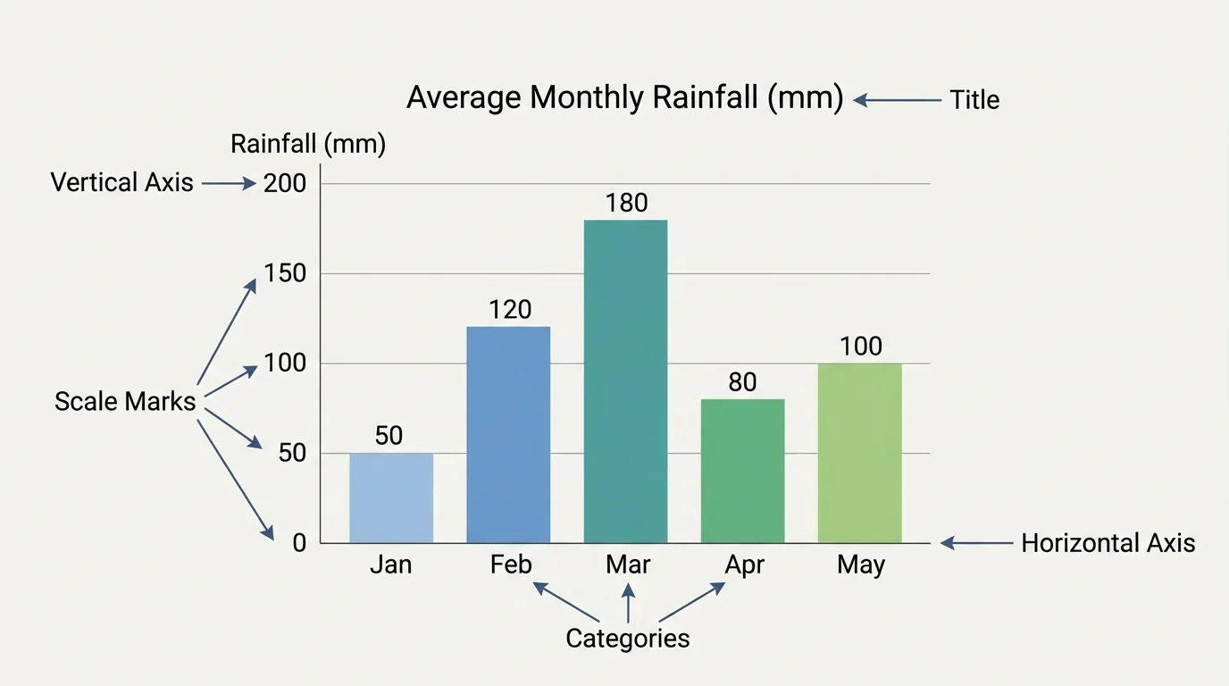
Suppose a bar graph shows the number of butterflies seen in three gardens: \(4\), \(7\), and \(7\). We can say the second and third gardens had the same count, and each had \(3\) more butterflies than the first garden because \(7 - 4 = 3\). That is a direct reading from the graph.
Later, when you study a new graph, use the same checklist from [Figure 2]: title first, labels next, and scale after that. Then compare the values instead of guessing from the picture alone.
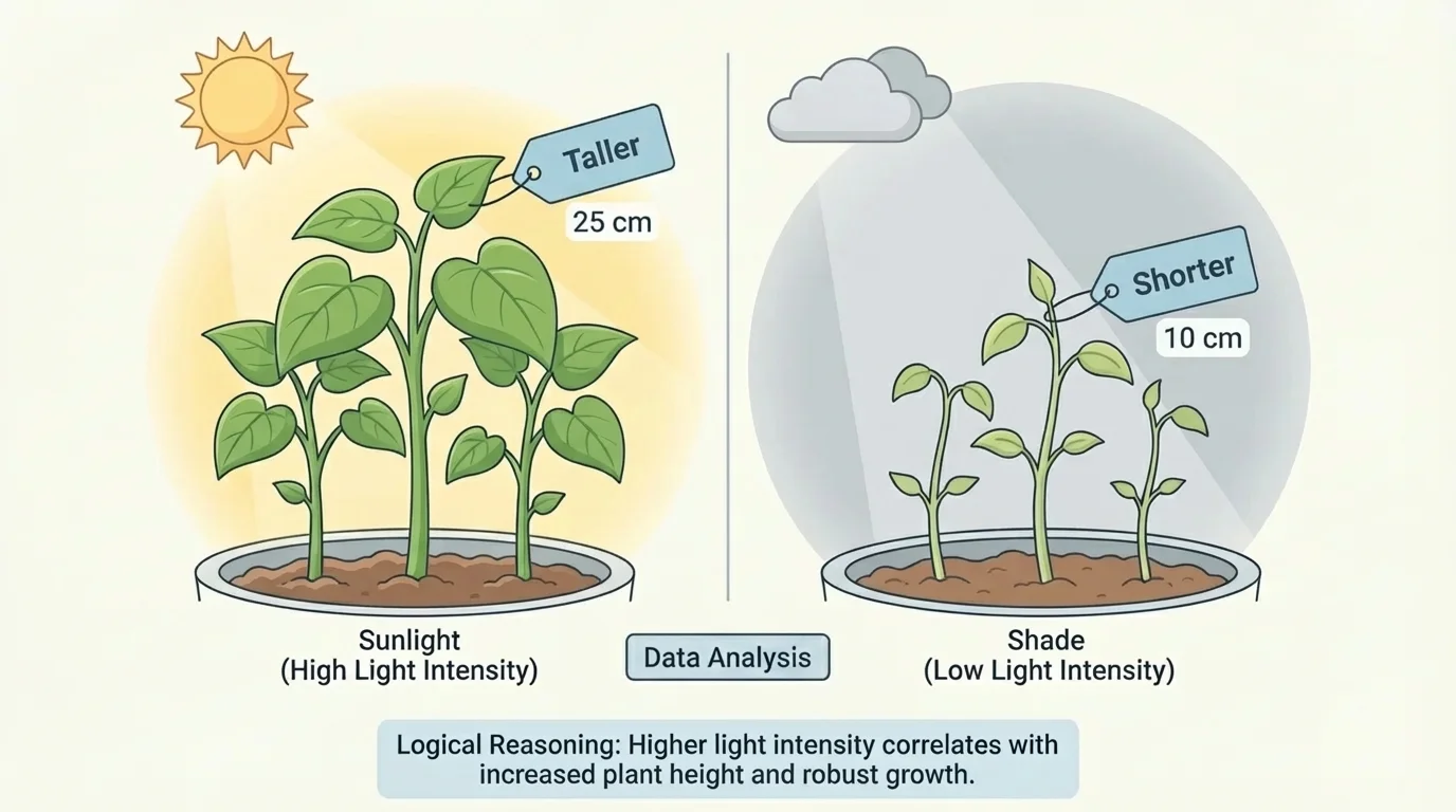
Interpreting data means using evidence to explain what the results may mean. As [Figure 3] illustrates with measured plant heights in two conditions, good explanations start with what the evidence actually shows. We should connect our claim to the data, not to a random guess.
For example, imagine two groups of bean plants. Group A is placed in sunlight, and group B is placed in shade. After one week, Group A has heights of \(9 \textrm{ cm}\), \(10 \textrm{ cm}\), and \(11 \textrm{ cm}\). Group B has heights of \(6 \textrm{ cm}\), \(7 \textrm{ cm}\), and \(7 \textrm{ cm}\). The data suggests that the plants in sunlight grew more during that week.
Notice the careful word suggests. Data can support an explanation, but one set of data may not prove everything. Maybe sunlight helped. That is a logical explanation because it matches the comparison. But saying "the shaded plants were sad" is not logical reasoning, because feelings were not measured.
Strong interpretation often follows a simple structure: claim, evidence, reasoning. The claim is what you think the data means. The evidence is the data you use. The reasoning explains why that evidence supports the claim.
Example: Making a claim from evidence
A class measures how far toy cars roll on two surfaces. On a smooth floor, the distances are \(120 \textrm{ cm}\), \(118 \textrm{ cm}\), and \(122 \textrm{ cm}\). On carpet, the distances are \(65 \textrm{ cm}\), \(70 \textrm{ cm}\), and \(68 \textrm{ cm}\).
Step 1: Compare the two groups.
The smooth-floor distances are all around \(120 \textrm{ cm}\), while the carpet distances are all around \(68 \textrm{ cm}\).
Step 2: State the claim.
Toy cars roll farther on a smooth floor than on carpet.
Step 3: Explain the reasoning.
The evidence supports the claim because every smooth-floor result is greater than every carpet result.
This is a stronger explanation than simply saying, "I like smooth floors better."
We can use the same kind of reasoning with the plant comparison in [Figure 3]. The visual difference matches the measured heights, so the explanation is based on evidence, not on a hunch.
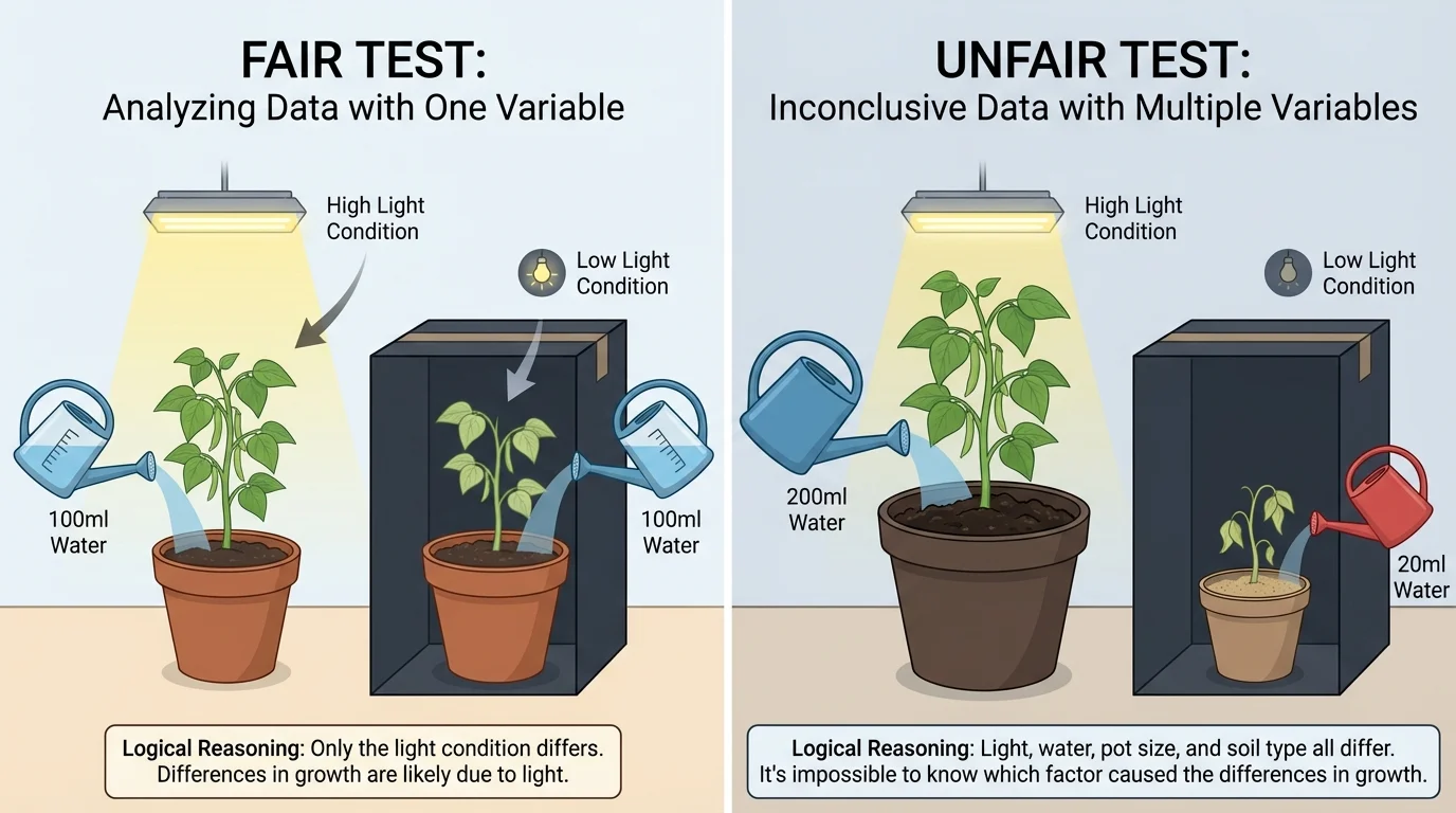
Sometimes data seems clear, but the way it was collected makes the conclusion weak. To make a fair comparison, a test should be as fair test as possible. That means changing one important thing at a time and keeping other conditions the same, as [Figure 4] shows.
If one plant gets more sunlight, more water, and a larger pot, we cannot tell which change caused the extra growth. Too many things changed at once. But if both plants get the same water, the same pot size, and the same type of soil, while only sunlight changes, the comparison is more useful.
Another problem is having too little data. If you flip a coin once and get heads, you cannot conclude that heads always happens. More data usually gives a clearer picture. A class that checks the weather for \(1\) day learns less than a class that checks for \(14\) days.
Missing labels can also cause confusion. A graph without a title or scale is hard to interpret. And if one measurement is very different from the others, we should think carefully about whether it was an error or a real event.
The fair and unfair comparisons remind us that conclusions depend not only on the numbers we read, but also on how those numbers were collected.
Remember that comparing means looking at how values are alike and different. You already use comparison in math when you decide whether \(8 > 5\) or whether \(12 - 4 = 8\). Data analysis uses that same careful thinking in science and everyday life.
Careful readers of data always ask: Was the test fair? Is there enough evidence? Are the labels clear? Those questions help protect us from weak conclusions.
Data analysis helps us understand weather. If students record temperature at the same time each day, they may notice that warmer days often happen when the sky is clear. That pattern can help explain why sunlight matters.
It also helps us study living things. A birdwatcher may count how many birds visit in the morning and afternoon. If the count is usually higher in the morning, that pattern suggests birds may feed more then. A gardener can measure soil moisture and compare it with plant drooping. A playground observer can measure shadow length and compare morning, noon, and afternoon values.
In each case, data helps answer questions about a phenomenon. The explanation may not be perfect at first, but it becomes stronger when students collect enough evidence and reason carefully from it.
From noticing to explaining
Scientists often begin with a simple observation, then gather data over time, look for patterns, and build explanations. The important idea is that explanations are tied to evidence. If new data appears, the explanation may improve or change.
This way of thinking is useful beyond science. Sports teams study scores and shot counts. Doctors record temperatures and heart rates. Farmers watch rainfall and plant growth. Everyone who uses evidence to explain what happens is analyzing and interpreting data.
A strong explanation often sounds like this: "The data shows that \(\dots\), so I think \(\dots\), because \(\dots\)." This sentence pattern helps students connect evidence to reasoning.
For example, "The data shows that the ice cube in sunlight melted in \(12 \textrm{ min}\) and the ice cube in shade melted in \(20 \textrm{ min}\), so I think sunlight made the ice melt faster, because the warmer conditions gave more heat energy." That explanation uses both data and logic.
Example: Explaining shadow changes
A student measures a pole's shadow and records \(150 \textrm{ cm}\) in the morning, \(80 \textrm{ cm}\) at noon, and \(140 \textrm{ cm}\) in the afternoon.
Step 1: Find the pattern.
The shadow gets shorter from morning to noon because \(150 - 80 = 70 \textrm{ cm}\). Then it gets longer again from noon to afternoon because \(140 - 80 = 60 \textrm{ cm}\).
Step 2: Make a claim.
The shadow changes length during the day.
Step 3: Support the claim with evidence.
The measurements show long, short, then long again.
Step 4: Add reasoning.
A logical explanation is that the Sun's position in the sky changes during the day, so the shadow changes too.
This explanation makes sense because it matches the measured data.
When students learn to analyze and interpret data, they become better thinkers. They learn to slow down, notice details, compare evidence, and explain the world with care. That is a powerful skill in science, in school, and in everyday life.