A map can do something a paragraph often cannot: it can make a hidden pattern visible in seconds. A city may seem like a random collection of neighborhoods until a map reveals how language, income, religion, transportation, and flood risk all overlap. Suddenly, geography stops being just "where things are" and becomes a way of explaining why human life looks different from place to place. When geographers create maps to display culture and environment, they are not just drawing locations. They are showing relationships, movement, concentration, connection, and change.
Geographers study spatial patterns, which are the arrangements of people, places, and physical features across Earth's surface. A pattern might appear as a cluster, a line, a ring, a gradient, or a scattered distribution. Cultural patterns include where languages are spoken, where religions are practiced, where migrants settle, and how cities are organized. Environmental patterns include rainfall zones, vegetation belts, earthquake regions, and river networks. Mapping these patterns helps us move from simple observation to explanation.
Location matters because culture and environment constantly interact. Mountain barriers may slow migration. Rivers may support dense settlement. Climate affects agriculture, and agriculture can shape diet, land ownership, and regional identity. In many parts of the world, physical geography influences where people live, but human choices also reshape environments through farming, industry, tourism, dam construction, and urban growth.
Culture refers to the beliefs, practices, languages, traditions, and ways of life shared by a group of people. Environment includes the natural surroundings and physical conditions of a place, such as climate, landforms, water, soils, and ecosystems. Human-environment interaction is the way people adapt to, depend on, and modify the natural world.
One of the most important ideas in geography is scale. A pattern visible at one scale may disappear or change at another. A neighborhood map may show one immigrant community concentrated in a few blocks, while a national map may show that same community spread across several major metropolitan areas. Geographers must choose the scale that best fits the question they are asking.
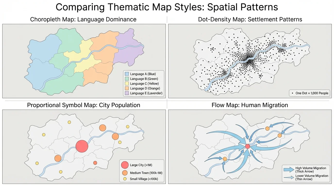
The same geographic information can be mapped in very different ways, and each method emphasizes a different part of the story, as [Figure 1] illustrates. A population pattern may look smooth and regional on one map, but concentrated into major cities on another. Choosing the right map type is one of the most important decisions in geographic analysis.
A reference map shows basic locations such as borders, roads, rivers, and cities. It helps people orient themselves. A thematic map, by contrast, focuses on one topic, such as population density, language distribution, rainfall, or deforestation. Most maps used to explain spatial patterns of culture and environment are thematic maps because they highlight a specific relationship.
Several thematic map types are especially useful. A choropleth map uses shading or color to show data values by area, such as states, counties, or countries. A dot-density map uses dots to represent occurrences such as people, crops, or livestock. A proportional symbol map uses larger or smaller symbols to show different totals. A flow map uses arrows or lines to show movement, such as migration, trade, or refugee routes. An isoline map connects places with equal values, such as temperature, air pressure, or elevation.
Modern geographers also rely on digital tools. GIS, or Geographic Information Systems, is used to layer information such as roads, flood zones, census data, land use, and school locations in one interactive system. Remote sensing gathers information about Earth from satellites, drones, or aircraft. Satellite images can reveal wildfire burn scars, shrinking lakes, urban expansion, and forest loss. GIS then helps analyze those patterns together.
These tools matter because geographic questions are often complex. For example, if a city wants to understand why some neighborhoods are more vulnerable to heat waves, it can combine land surface temperature, tree cover, building density, age of residents, and access to cooling centers. A single map layer gives some information; multiple layers create an explanation.
Satellite data has become so detailed that geographers can track changes in coastlines, glaciers, crop health, and urban growth over time with repeated images of the same place.
Mapmakers also classify data in categories. If values are grouped differently, the pattern may appear stronger or weaker. This is why reading a legend carefully is essential. A dramatic-looking map may simply use class breaks that exaggerate contrast.
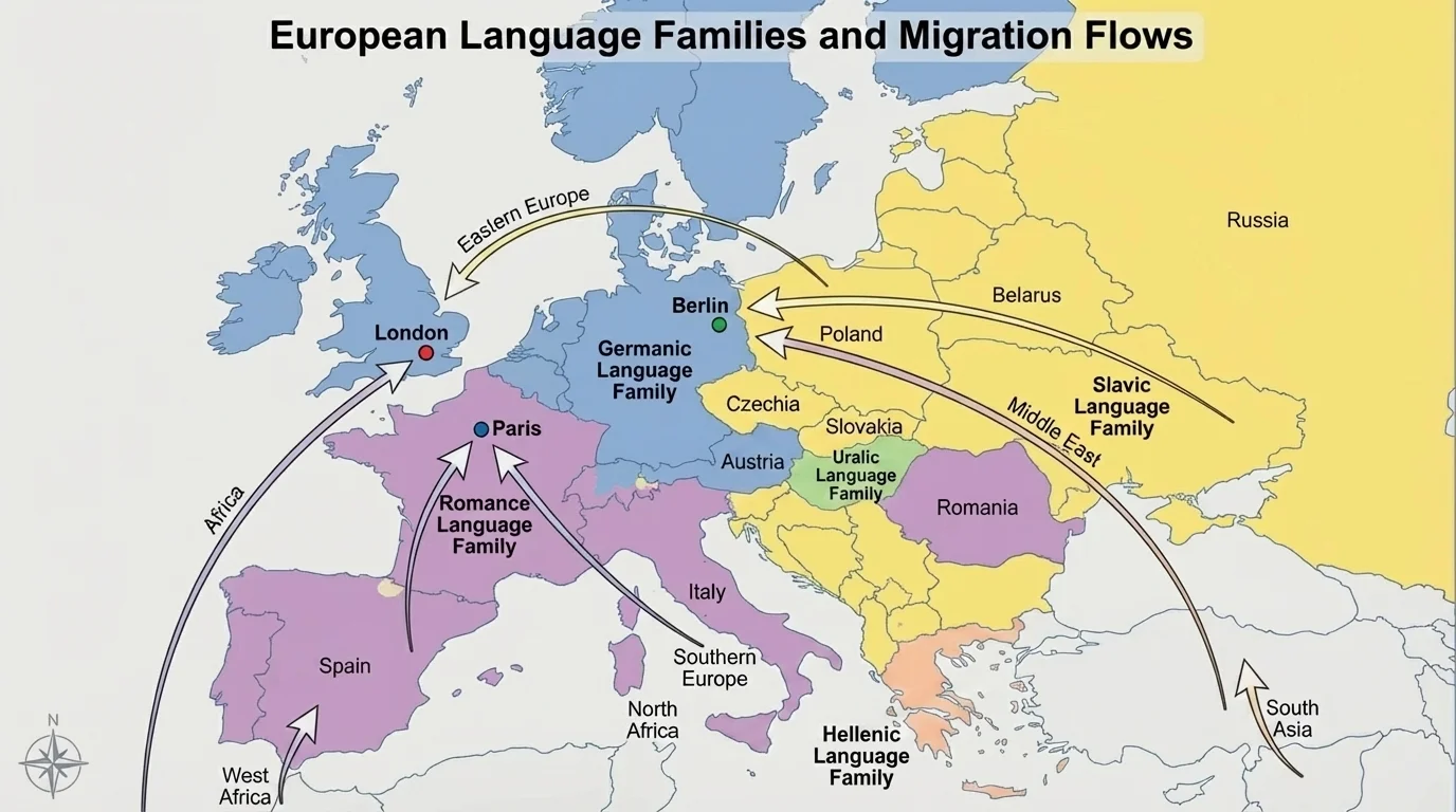
Cultural patterns often become much clearer once they are mapped, and [Figure 2] shows how clustering and diffusion can appear in the same region at the same time. A language may dominate one area, fade along a border, and mix with other languages in large cities shaped by migration. Maps help geographers see where cultural traits are concentrated and how they spread.
One major concept is cultural diffusion, the spread of ideas, beliefs, technologies, or customs from one place to another. Diffusion can occur through migration, trade, conquest, media, tourism, and digital communication. Mapping diffusion can show both origin points and movement pathways. For instance, the spread of major world religions can be mapped across centuries, while contemporary music styles or social media trends can spread globally in far shorter periods.
Language maps provide a powerful example. In Europe, Romance languages such as Spanish, French, and Italian cluster in regions historically influenced by Latin, while Germanic and Slavic languages dominate other zones. Yet large cities such as London, Berlin, and Paris now contain many additional language communities due to migration. A simple political map cannot reveal this complexity, but a thematic map can.
Religion can also be mapped by dominant affiliation, sacred sites, pilgrimage routes, or local diversity. In South Asia, for example, maps can show Hindu-majority areas, Muslim-majority regions, Sikh sacred centers in Punjab, and the importance of the Ganges River in spiritual geography. These patterns are not random; they are shaped by history, migration, empire, trade, and landscape.
Urban cultural patterns are another important field of mapping. Within a single city, geographers may map ethnic neighborhoods, housing styles, places of worship, business districts, or festival locations. These patterns often reflect immigration waves, zoning policies, transportation routes, and housing costs. The same city may reveal segregation, cultural mixing, or gentrification depending on what is mapped and at what scale.
Maps can reveal both diversity and inequality. A cultural map is not just a picture of differences. It can show access to schools, hospitals, parks, transit, or safe housing across communities. When cultural patterns overlap with unequal environmental conditions, mapping becomes a tool for investigating justice as well as location.
Migration often transforms older cultural regions rather than simply replacing them. This is why many places show layered identities: long-standing traditions remain while new cultural influences reshape food, language, business, and public space.
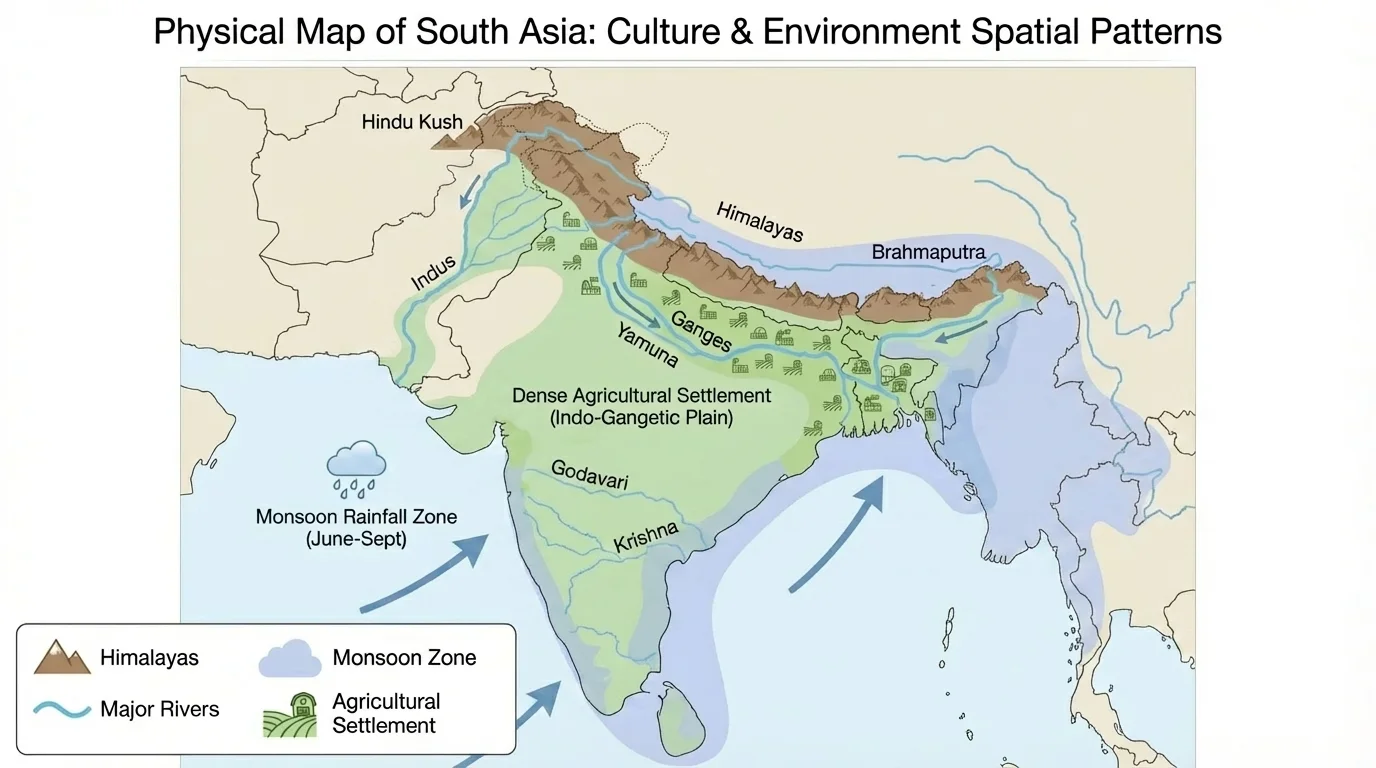
Environmental patterns are also strongly spatial, and [Figure 3] demonstrates how terrain, water, and climate create visible regions that affect where people settle and farm. Mountains, plains, coastlines, deserts, and river systems are not just background scenery. They organize movement, opportunity, and risk.
Climate maps show temperature zones and precipitation patterns. Vegetation maps show where forests, grasslands, tundra, and deserts are found. Elevation maps reveal mountain barriers and drainage basins. Hazard maps identify places at risk from earthquakes, hurricanes, floods, droughts, volcanic eruptions, or wildfire. Each of these helps explain why certain human activities are common in some regions and rare in others.
South Asia offers a strong example. The Himalayan Mountains limit movement and shape rainfall patterns. Major rivers such as the Ganges, Brahmaputra, and Indus support farming and dense populations. Seasonal monsoon winds bring essential rain, but also create flooding risk. Mapping these environmental features helps explain why the Indo-Gangetic Plain supports such intense agricultural use and such a large population.
Environmental mapping also reveals change over time. In the Sahel region of Africa, maps of rainfall, vegetation cover, and land use can help explain desertification pressure. In the Arctic, maps of sea ice extent show how climate change is altering ecosystems, shipping routes, and Indigenous livelihoods. In coastal regions, maps of sea level rise and storm surge zones help communities plan for future hazards.
Land use maps connect physical geography to human decisions. A region may be mapped as forest, cropland, pasture, wetland, urban area, or industrial zone. These categories show how people adapt to local conditions and how they transform them. A river valley with fertile soil might become farmland, while a dry coast with deep harbors might grow into a trade-centered city.
When students compare cultural and environmental layers together, stronger explanations emerge. A dry climate may help explain low population density, but irrigation technology may create agricultural clusters. Steep slopes may discourage urban growth, but tourism may still flourish if transportation improves. Geography is rarely caused by one factor alone.
A map is both a tool and an argument, and [Figure 4] makes clear that design choices shape what viewers notice first. Two maps can use the same data and still suggest different conclusions. That is why geographers must not only read maps carefully but also design them responsibly.
Every effective map needs several key elements: a clear title, an accurate legend, a readable scale, and orientation. Symbol choice matters. Colors may imply meaning; blue often suggests water or cool temperatures, while red may suggest heat, danger, or concentration. If symbols are too large, they may hide smaller features. If labels are crowded, the map becomes hard to interpret.
Map projection is especially important. Because Earth is round and most maps are flat, every projection creates distortion. Some distort area, some distort shape, some distort distance, and some distort direction. The Mercator projection preserves direction well for navigation but enlarges high-latitude areas. Equal-area projections better represent relative size. If students do not recognize this, they may misunderstand the true scale of regions.
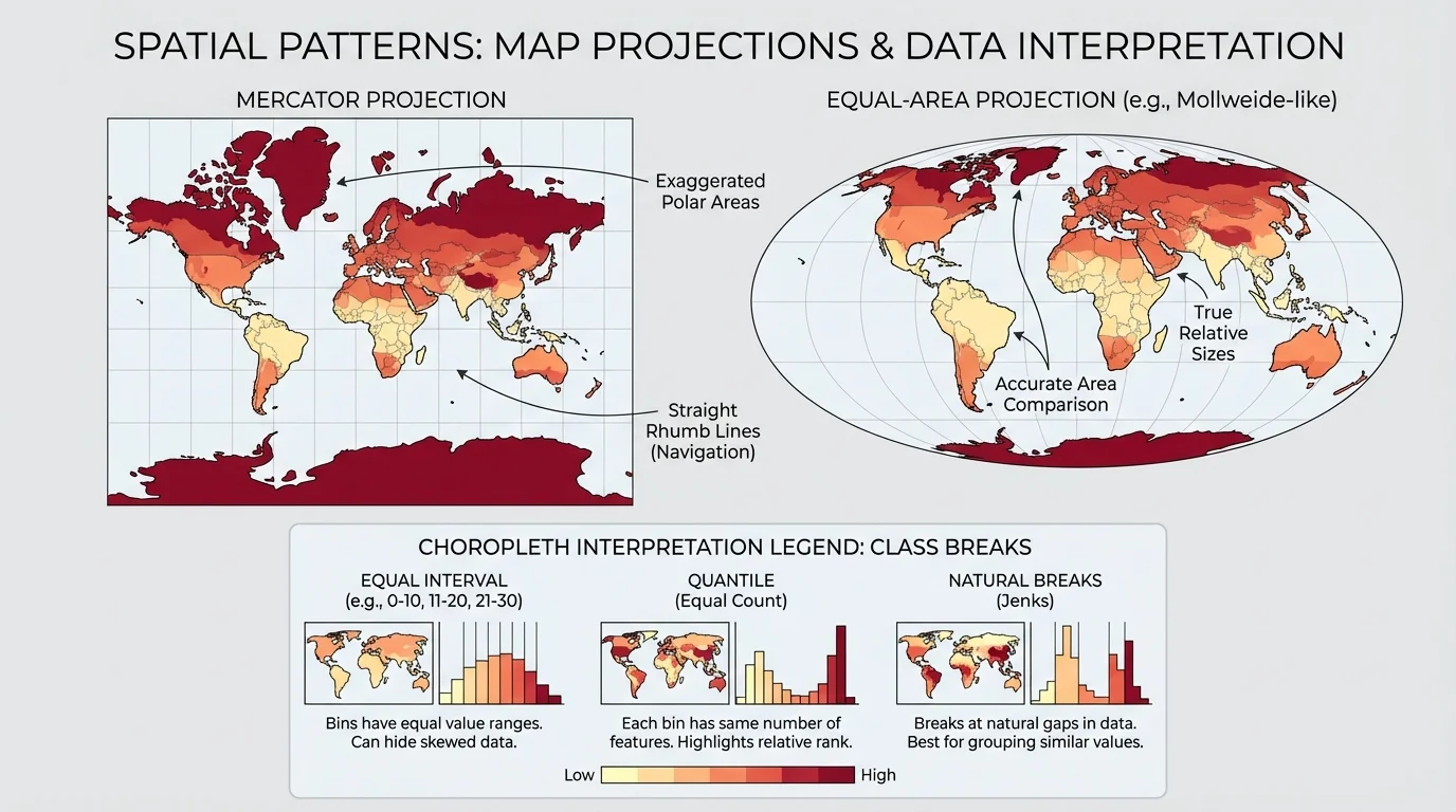
Classification also matters on choropleth maps. Suppose one map of income uses five equal intervals while another uses quantiles. The boundaries between "high" and "low" values may shift even though the underlying data stays the same. This is why maps should be interpreted along with source information, date, and method.
Projection and classification are not technical side notes. They influence whether a pattern appears dramatic, balanced, concentrated, or diffuse. Good geographers ask not only "What does this map show?" but also "How was this map made?"
Recall that all maps simplify reality. No map can include every detail of a place. Mapmakers always select, reduce, and symbolize information so that a pattern becomes readable.
A well-designed map helps viewers compare places quickly without being misled. A poorly designed map may confuse categories, hide uncertainty, or imply false precision. This is especially important when maps influence public decisions.
Case studies show how mapping turns geographic information into explanation. They also remind us that cultural and environmental patterns differ across regions because history, power, and physical conditions differ.
In Europe, mapping language families alongside migration trends helps explain why some areas preserve strong regional identities while major cities become increasingly multilingual. This pattern is not evidence of cultural disappearance; instead, it often shows cultural layering, adaptation, and exchange.
[Figure 5] In South Asia, monsoon maps, river basin maps, and population maps together explain why agriculture is concentrated in particular plains and deltas. Rice cultivation, seasonal labor patterns, and flood adaptation all connect to environmental rhythms.
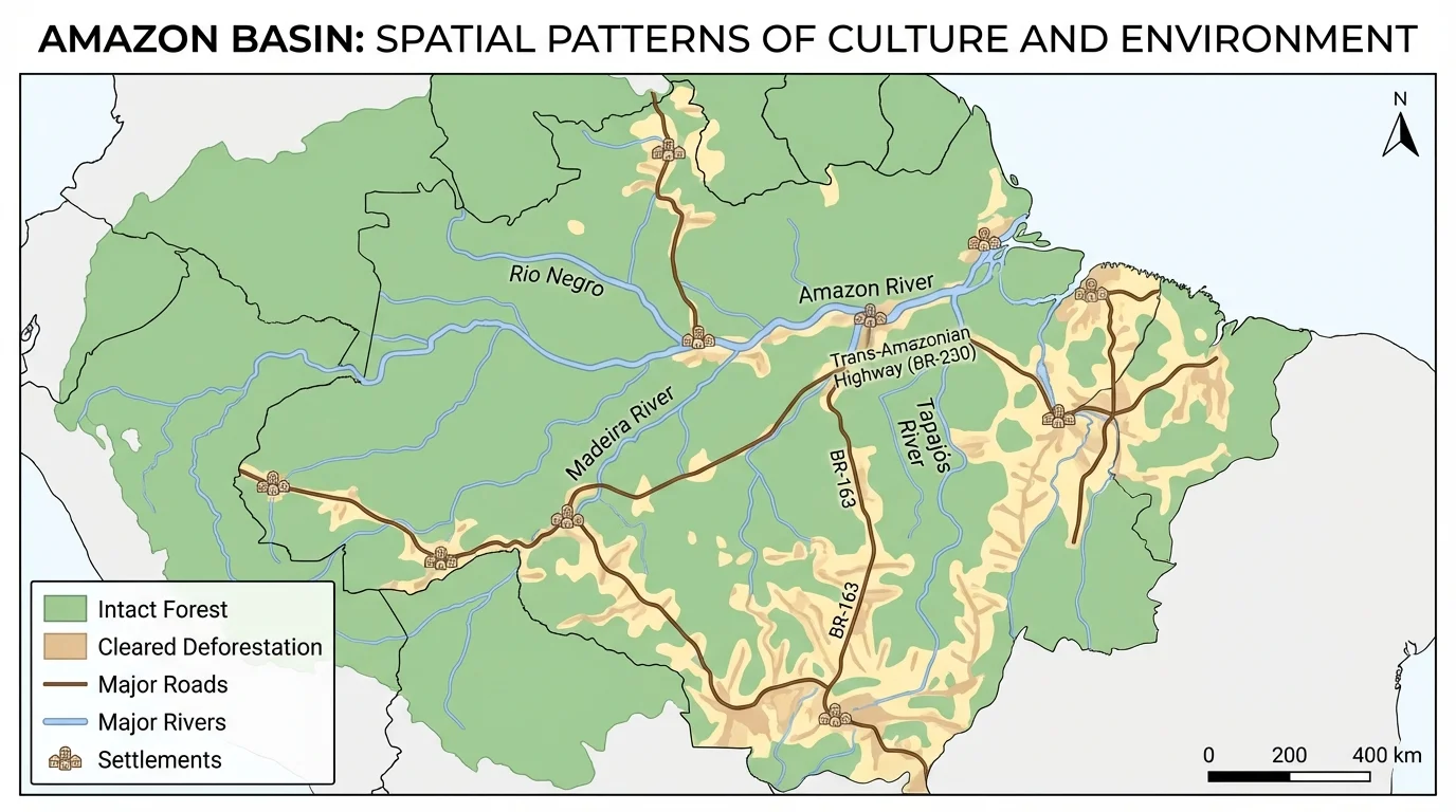
In the Amazon Basin, road networks often predict where forest loss will occur. Deforestation does not spread evenly across the region. It frequently advances in corridors along roads, rivers, settlement fronts, cattle ranches, and logging zones. Mapping these patterns helps governments, scientists, and Indigenous communities identify where pressure is strongest.
In California, wildfire maps show another important set of spatial patterns. These maps are used to guide emergency planning, insurance decisions, evacuation routes, and building codes. A fire map is not simply an environmental map; it becomes a map of human vulnerability when homes and infrastructure are added.
These examples also show why layered mapping is so powerful. A single map rarely answers a major question. But when cultural and environmental information are combined, students can explain not only where a pattern occurs, but why it occurs there.
Case study analysis: the Amazon
Step 1: Identify the environmental layer.
A land cover map shows dense rainforest, rivers, and protected areas.
Step 2: Add the human activity layer.
A transportation map adds highways, secondary roads, mining zones, and settlements.
Step 3: Compare the pattern.
Forest clearing appears concentrated near roads rather than evenly distributed across the basin.
Step 4: Explain the relationship.
Road access lowers transportation costs, increases land speculation, and opens more land to logging and ranching.
The map does more than locate deforestation. It explains the spatial process behind it.
Later comparisons with this map can help identify whether policy changes, enforcement, or new infrastructure reduce or increase the spread of clearing over time.
Maps are powerful, but they are never neutral copies of reality. Data may be outdated, incomplete, or collected differently across regions. Political borders may hide local diversity. A national map of religion may make a country look uniform even when local communities are highly varied.
There are also ethical issues. Mapping cultural groups can support visibility and rights, but it can also expose vulnerable communities to discrimination or surveillance. For that reason, geographers think carefully about scale, privacy, and purpose. In some cases, aggregated data is safer than highly detailed local data.
Spatial distribution should also be interpreted cautiously. A cluster on a map may reflect real concentration, but it may also result from where data was collected, how boundaries were drawn, or which categories were used. This is one reason geographers compare multiple sources and multiple map types.
"The map is not the territory."
— Alfred Korzybski
That statement matters because maps represent the world selectively. They are invaluable tools, but they must be questioned, checked, and compared with field observations, historical context, and other evidence.
Maps are essential for addressing geographic issues because problems are rarely spread evenly across space. Migration pressures may concentrate at borders and in major cities. Water scarcity may be severe in one river basin and mild in another. Pollution may affect neighborhoods differently depending on wind, topography, industry, and income.
When planners map transit access, housing costs, and employment centers, they can identify transportation inequality. When health officials map heat, tree cover, and age distribution, they can target cooling resources. When conservation groups map biodiversity hotspots together with roads and mines, they can identify high-risk zones for habitat loss.
This is why map-making is more than a classroom skill. It is part of how societies make decisions. Clear maps can support disaster preparedness, environmental protection, urban planning, cultural preservation, and fairer distribution of resources. Strong geographic thinking means asking what pattern is visible, what forces produced it, and what actions the pattern suggests.
Whether the subject is language diversity in a global city, crop zones shaped by monsoons, or wildfire risk at the edge of suburbia, maps help connect human systems and physical features. They allow students to see culture and environment not as separate topics, but as overlapping parts of the same geographic world.