A basketball team wins more games after getting new uniforms. Did the uniforms cause the wins? Probably not. Maybe the players practiced more, or maybe new team members joined. This is why learning to analyze data is so important. Data can reveal exciting patterns, but it can also trick us if we rush to conclusions. Good investigators look carefully, compare results, and ask, "What does the evidence really show?"
When scientists, engineers, doctors, and students do an investigation, they collect information called data. Data helps turn guesses into evidence. Instead of saying, "I think plants grow better in sunlight," we can measure plant heights and compare the results. Then our conclusion is based on what we observed, not just what we believed.
Data analysis means examining data closely to find patterns, relationships, and answers. Interpreting data means explaining what those patterns might mean. These two jobs work together. First we organize and study the numbers or observations. Then we decide what they tell us.
Data is information collected during an investigation. Analysis is the careful study of that information. Interpretation is explaining what the information means. Evidence is data used to support a conclusion.
Careful data analysis matters because the world is full of claims. A cereal box may claim that its product helps children stay focused. A sports ad may say a shoe helps people run faster. Weather reports use data to predict storms. Doctors use data to decide whether a medicine works. In all of these cases, people need to examine results carefully before deciding what is true.
Some data describes qualities. Some data uses numbers. Qualitative data tells about qualities or characteristics, such as color, smell, texture, or shape. For example, if students test different soils for planting beans, they may record that one soil is dark and crumbly while another is sandy and dry.
Quantitative data uses numbers that can be counted or measured. Plant height of \(12 \textrm{ cm}\), temperature of \(24 \textrm{^\circ C}\), and \(15\) germinated seeds are all quantitative data. Quantitative data is especially useful because it can be compared more exactly.
Investigations often use both kinds. If students test paper towel brands, they might observe that one towel feels thicker, which is qualitative data, and they might measure that it absorbs \(35 \textrm{ mL}\) of water, which is quantitative data. Both observations help explain the results.
To measure well, you need foundational skills such as reading rulers, thermometers, scales, clocks, and tally charts. Good data depends on careful measuring and recording.
Organizing data is also important. If notes are messy, mistakes are easy to make. Scientists often use tables to keep values in order.
| Trial | Water Given | Plant Height After 2 Weeks |
|---|---|---|
| 1 | \(10 \textrm{ mL}\) | \(6 \textrm{ cm}\) |
| 2 | \(20 \textrm{ mL}\) | \(9 \textrm{ cm}\) |
| 3 | \(30 \textrm{ mL}\) | \(11 \textrm{ cm}\) |
Table 1. A simple data table showing how much water each plant received and how tall it grew.
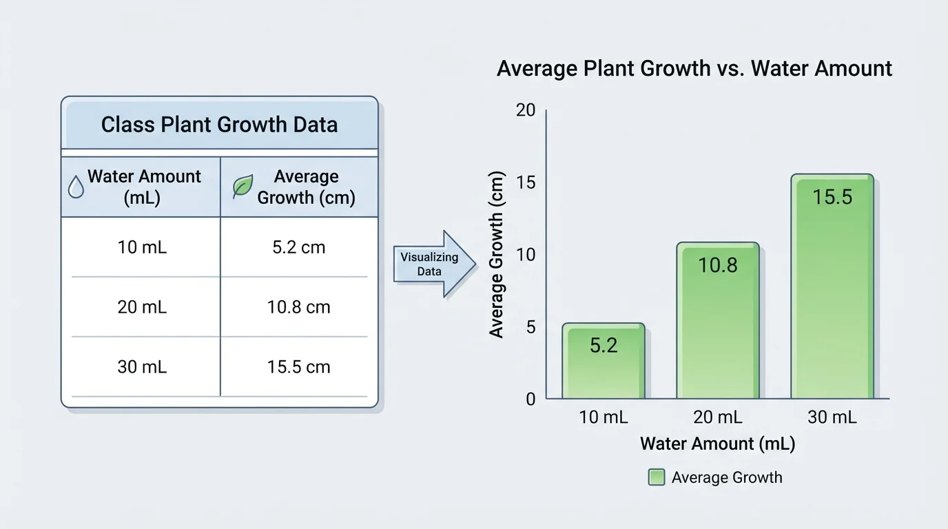
Patterns in data often become easier to notice in a graph, as [Figure 1] shows with plant-growth data. A list of numbers can show us a lot, but a graph can make a trend stand out quickly. For example, if taller bars appear as the water amount increases, we may notice that more water is linked with more growth.
A trend is a general pattern in data. The trend might go upward, downward, or stay about the same. If students track daily temperature for a week and see values of \(18, 19, 21, 23, 24, 25, 26\), the trend is upward. If test scores in two groups stay close together, the trend might be stable.
When comparing findings, ask questions like these: Which result is greatest? Which is smallest? Are the differences large or small? Do two groups show a similar pattern? These questions help us notice both similarities and differences.
Suppose two classes test how fast ice melts in sunlight. Class A finds that a cube melts in \(12\) minutes, and Class B finds \(13\) minutes. Those results are very similar. But if one class gets \(12\) minutes and the other gets \(25\) minutes, then the findings are clearly different, and the classes should ask why.
When students compare a table and a graph, it is useful to see that the same data can be displayed in more than one way. Good investigators choose a display that makes the pattern easiest to understand.
Patterns are clues, not automatic answers. A pattern can suggest an idea, but investigators still need to think carefully. If plants with more water grow taller, that pattern may be important, but students should still ask whether all the plants got the same sunlight, soil, and pot size.
Data displays must also be fair. A graph should have a clear title, labeled axes, and equal spacing. If the scale is confusing, the graph can make a small difference look huge or hide an important change.
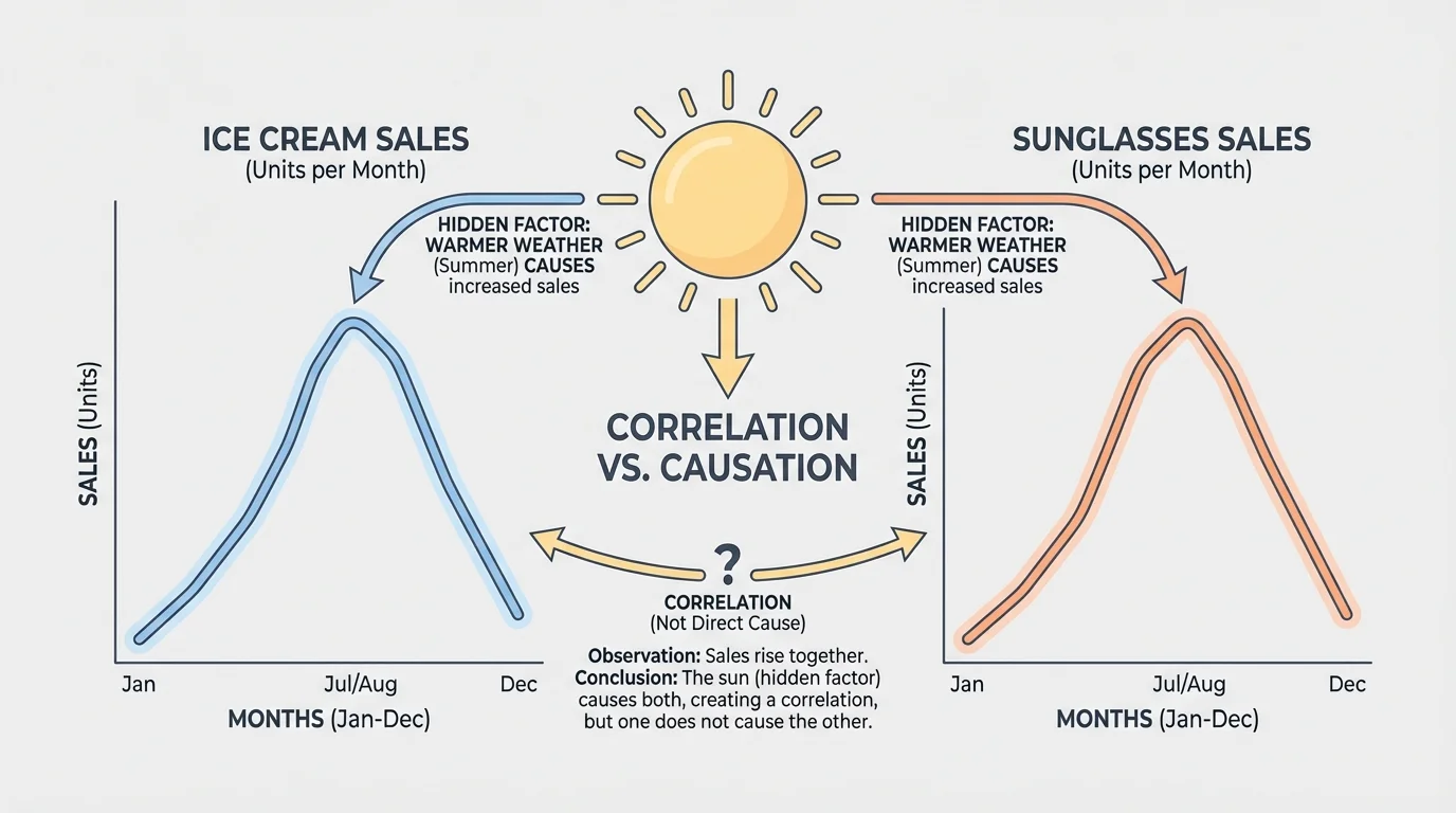
One of the most important ideas in data analysis is the difference between correlation and causation. Two things can change together, as [Figure 2] illustrates, without one causing the other. Correlation means there is a connection or pattern between two sets of data. Causation means one thing actually makes another thing happen.
For example, ice cream sales and sunglasses sales both rise in summer. These two sets of data are correlated. But buying ice cream does not cause people to buy sunglasses. The hidden factor is hot, sunny weather. Weather affects both.
Here is another example. Imagine that students notice that children who wear larger shoes often read better than children who wear smaller shoes. Does shoe size cause reading skill? No. Older children usually have bigger feet, and older children have had more time to practice reading. Age is the hidden factor.
To decide whether something may be a cause, investigators try to make a fair test. In a fair test, only one variable changes while other conditions stay the same. If plants get different amounts of water but the same light, soil, and pot size, water is the main changed variable. That makes it easier to test whether water causes growth differences.
Even then, one test may not be enough. Repeated investigations build stronger evidence. Matching trends alone are not proof. Scientists want careful experiments, repeated trials, and data from many situations before claiming causation.
Some graphs look convincing even when the conclusion is wrong. That is why scientists do not stop at "these lines both go up." They ask what else might explain the pattern.
This idea protects us from mistakes. If a website says a bracelet improves test scores because students wearing it got higher grades, we should ask whether the bracelet caused the change or whether those students also studied more, slept better, or had extra tutoring.
Sometimes a data set has many values, and it is hard to compare them one by one. Simple statistics help summarize the data. Four basic tools are mean, median, mode, and range.
The mean is the average. Add all the values and divide by the number of values.
\[\textrm{mean} = \frac{\textrm{sum of values}}{\textrm{number of values}}\]
The median is the middle value when numbers are arranged in order. The mode is the value that appears most often. The range tells how spread out the data is.
\[\textrm{range} = \textrm{greatest value} - \textrm{smallest value}\]
Worked example 1: Finding the mean
A class measures the heights of bean plants in centimeters: \(8, 10, 9, 11, 12\).
Step 1: Add the values.
\(8 + 10 + 9 + 11 + 12 = 50\)
Step 2: Count the number of values.
There are \(5\) values.
Step 3: Divide the total by the number of values.
\(50 \div 5 = 10\)
The mean plant height is \(10 \textrm{ cm}\).
The mean is useful, but it can be affected by one very large or very small value. That is why investigators also look at median and range.
Worked example 2: Finding median and mode
A student records the number of pages read each night: \(12, 15, 15, 18, 20\).
Step 1: Put the numbers in order.
They are already ordered: \(12, 15, 15, 18, 20\).
Step 2: Find the middle value.
The middle number is \(15\), so the median is \(15\).
Step 3: Find the value that appears most often.
The number \(15\) appears twice, more than any other value, so the mode is \(15\).
The median is \(15\), and the mode is also \(15\).
When data values are close together, the range is small. When values are spread far apart, the range is large.
Worked example 3: Finding the range
Paper airplane flight distances are \(4, 6, 7, 5, 9\) meters.
Step 1: Find the greatest value.
The greatest value is \(9\).
Step 2: Find the smallest value.
The smallest value is \(4\).
Step 3: Subtract.
\(9 - 4 = 5\)
The range is \(5 \textrm{ m}\).
These tools help us compare groups. If two classes both have a mean score of \(80\), they may seem similar. But if one class has a range of \(4\) and the other has a range of \(25\), the second class has much more spread in its scores.
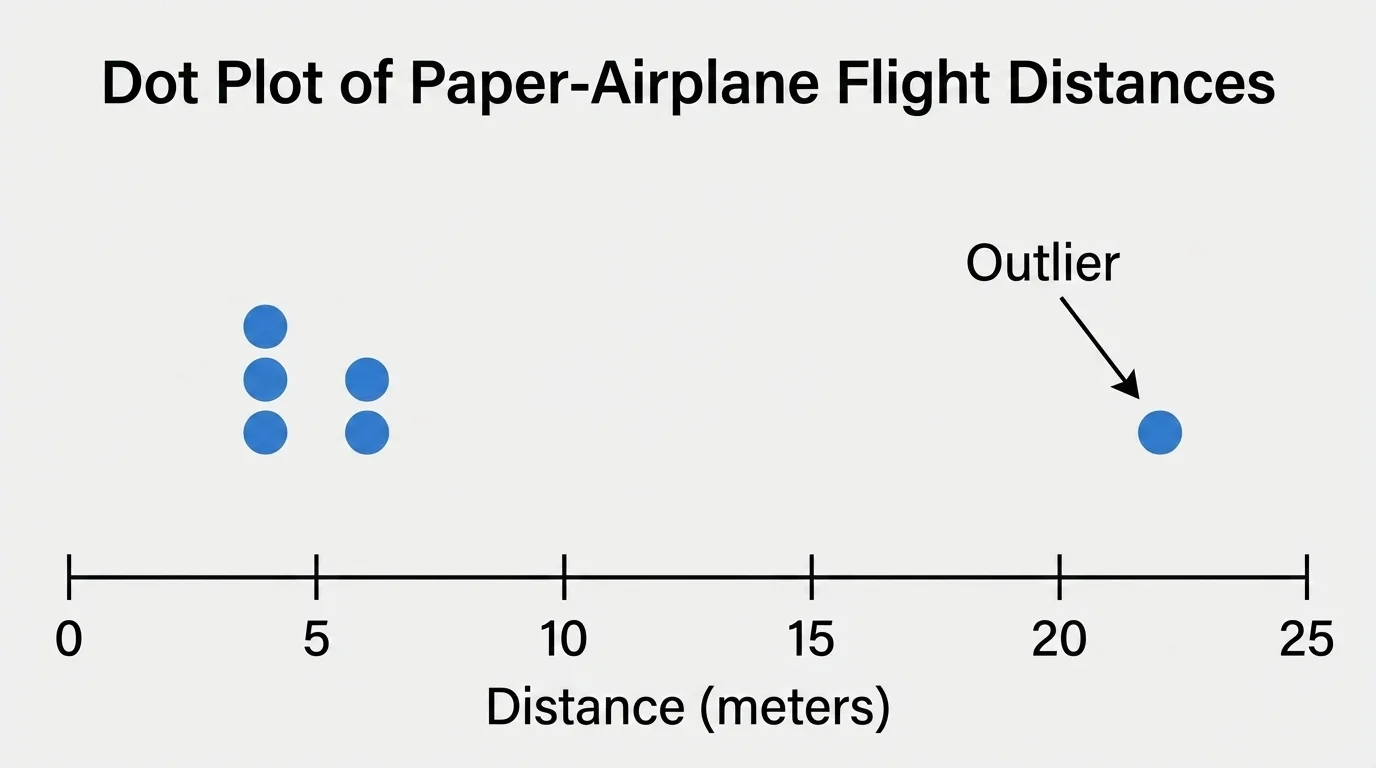
No measurement is perfect. There can be error in any investigation, and repeated trials help us notice unusual results, as [Figure 3] shows. Error does not always mean someone did something wrong. It can come from a ruler being read slightly differently, a stopwatch starting a bit late, or wind changing the path of a paper airplane.
One way to reduce error is to repeat the test several times. If four trials give similar results and one trial is very different, the unusual one might be an outlier. An outlier is a value that is far from the others.
Suppose airplane flights measure \(6 \textrm{ m}\), \(6.2 \textrm{ m}\), \(6.1 \textrm{ m}\), \(6.3 \textrm{ m}\), and \(2 \textrm{ m}\). The value \(2 \textrm{ m}\) is much smaller than the others. Perhaps the plane hit a wall, or the throw was weak. Investigators should not ignore it automatically, but they should ask whether something unusual happened.
A fair test controls variables. If students want to know whether a ramp height changes toy car speed, they should keep the same car, same ramp surface, and same starting point. Only the height should change. If many things change at once, it becomes hard to know what caused the result.
Looking back at the data display, repeated trials make the cluster of usual results easy to see. This helps investigators decide whether one result is probably normal variation or whether it needs more checking.
Error analysis helps us trust results more wisely. Investigators study where mistakes or changes might have happened. If the same kind of error appears again and again, they can improve the procedure. Better tools, more trials, and careful measuring all help make conclusions stronger.
Students do not need perfect data to learn from an investigation. They do need honest data, careful recording, and thoughtful analysis.
Sometimes different groups investigate the same question and get slightly different answers. This is normal. The job is to compare the findings and decide whether they mostly agree, partly agree, or clearly disagree.
Imagine three groups test how long sugar takes to dissolve in warm water. Their times are \(40\) seconds, \(43\) seconds, and \(41\) seconds. These findings are very similar. If another group gets \(95\) seconds, that result is very different, and the class should ask whether the water temperature, sugar amount, or stirring method changed.
When analyzing similarities and differences, look at the size of the difference. A difference of \(1\) or \(2\) units may be small in some experiments. A difference of \(50\) units may be huge. Context matters. In a race, \(1\) second can be important. In tree height, \(1\) millimeter might not matter much.
| Group | Time for Sugar to Dissolve | Comparison |
|---|---|---|
| A | \(40 \textrm{ s}\) | Very close to B and C |
| B | \(43 \textrm{ s}\) | Very close to A and C |
| C | \(41 \textrm{ s}\) | Very close to A and B |
| D | \(95 \textrm{ s}\) | Very different; investigate why |
Table 2. Comparison of four groups' findings from the same dissolving investigation.
Scientists often compare not just single numbers but whole patterns. Two investigations may have different exact values but show the same trend. For example, both might show that warmer water dissolves sugar faster, even if one class recorded \(35\) seconds and another recorded \(38\) seconds.
Data analysis is not only for science labs. Weather forecasters compare temperatures, wind speeds, and air pressure to predict storms. Doctors compare patient test results before and after treatment. Sports teams track points, rebounds, passes, and running speeds to improve performance.
Stores study which items sell better in summer or winter. Engineers test materials many times before building bridges or machines. Environmental scientists compare water-quality data from different rivers to see where pollution is a problem. In each case, people gather evidence, look for patterns, compare results, and try not to confuse correlation with causation.
"The goal is to turn data into information, and information into understanding."
— Carly Fiorina
Even at school, students use data when they survey favorite books, track plant growth, measure shadows, or compare recycling amounts from week to week. Learning these skills now builds a strong foundation for later science and math work.
A good conclusion answers the original question and uses evidence from the data. It does not say more than the data can support. If a test shows that one paper towel absorbed \(10 \textrm{ mL}\) more water than another in three trials, a careful conclusion is that this brand absorbed more water in this investigation. A careless conclusion would be saying it is the best paper towel in the world.
Strong conclusions often mention patterns, statistical summaries, and possible errors. For example, a student might write that the mean height of plants given \(30 \textrm{ mL}\) of water was greater than the mean height of plants given \(10 \textrm{ mL}\), but that more trials are needed because one plant grew unusually slowly.
The best investigators stay curious. They use data to support ideas, but they also stay open to better explanations. That is what makes science powerful: conclusions grow stronger when they are tested, checked, and compared with new evidence.