Why do siblings who share the same parents still look and act noticeably different? Why can a genetic trait be common in one group yet rare in another? Biology often feels personal, but the patterns behind heredity become clear only when we step back and study many individuals at once. That is where statistics and probability become powerful: they help scientists move from single family stories to population-level explanations.
In genetics, we rarely ask only, "What trait will one offspring have?" More often, the scientific question is, "What pattern should appear across many offspring?" or "How much variation is normal in a population?" These questions matter in medicine, agriculture, ecology, and engineering. A plant breeder may track flower color ratios. A medical researcher may compare the frequency of a gene variant in different groups. A biomedical engineer may test whether a change in material thickness is related to strength. In each case, data must be organized, modeled, and interpreted carefully.
Traits are features of organisms, such as eye color, blood type, seed shape, height, or enzyme activity. Some traits are strongly influenced by single genes, while many others are influenced by multiple genes and environmental factors. Because populations contain many individuals, scientists use data to describe what is typical, what is unusual, and what patterns may be explained by inheritance.
When we count how often a trait appears, compare averages, or graph a relationship between two variables, we are using statistics. When we predict the chance of a trait appearing in offspring, we are using probability. Together, these ideas allow us to test claims instead of relying on guesses.
Probability is the likelihood that a particular event will occur. In genetics, it is often expressed as a fraction, decimal, or percent.
Statistics is the study of collecting, organizing, analyzing, and interpreting data.
Variation refers to differences in traits among individuals in a population.
Distribution describes how values or traits are spread across a group.
A key idea is that probability predicts what is expected over many events, not what must happen in each single case. If the probability of a trait is \(0.25\), that means we expect about \(25\%\) of a large number of outcomes to show that trait. It does not guarantee that exactly \(1\) out of every \(4\) individual cases will match.
Biologists often study a population, which is a group of individuals of the same species living in the same area or being studied together. Within a population, some traits are discrete traits, such as attached versus unattached earlobes, where categories are distinct. Other traits are continuous traits, such as height or mass, where many values are possible.
Scientists also distinguish between a population and a sample. A sample is a smaller group taken from the population. If the sample is biased, conclusions may be misleading. For example, measuring only the tallest plants in a field would give a poor estimate of average height.
From earlier math study, remember that a ratio compares quantities, a proportion compares parts to a whole, and a graph can reveal patterns that are hard to notice in a list of numbers.
Another important idea is the difference between expected and observed results. Expected results come from a model, such as a genetic probability. Observed results come from actual data. In real experiments, observed values may differ from expected values because of chance, sample size, measurement error, or because the model is incomplete.
In simple inheritance problems, probability helps predict how traits should be distributed among offspring. As [Figure 1] illustrates, an expected ratio such as \(3:1\) is a statistical pattern that appears more clearly when many offspring are counted, not a rule that every small family must follow.
Suppose two heterozygous pea plants for seed shape are crossed, with \(R\) representing round and \(r\) representing wrinkled. The cross is \(Rr \times Rr\). The possible offspring genotypes are \(RR\), \(Rr\), \(Rr\), and \(rr\). That gives a genotype ratio of \(1:2:1\) and a phenotype ratio of \(3:1\), because three of the four possible combinations produce round seeds.
The probability of a wrinkled-seed offspring is \(\dfrac{1}{4}\), or \(0.25\), or \(25\%\). If there are \(20\) offspring, the expected number of wrinkled seeds is \(20 \times 0.25 = 5\). If there are \(200\) offspring, the expected number is \(200 \times 0.25 = 50\). The larger sample usually gives a pattern closer to the expected ratio.
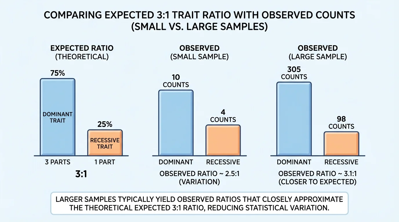
This is why scientists avoid drawing big conclusions from very small samples. If a class grows only \(4\) plants, getting \(4\) round seeds and \(0\) wrinkled seeds does not disprove the \(3:1\) expectation. Chance variation is stronger in small samples.
Genetics probability example
A certain trait appears only in homozygous recessive offspring from parents with genotypes \(Aa\) and \(Aa\). Predict the expected number of recessive-trait offspring in a group of \(48\).
Step 1: Find the probability of the recessive phenotype.
For \(Aa \times Aa\), the recessive phenotype occurs only with \(aa\), so the probability is \(\dfrac{1}{4}\).
Step 2: Multiply the total number by the probability.
\(48 \times \dfrac{1}{4} = 12\)
Step 3: Interpret the result.
The expected number is \(12\), but the observed number in a real group may be slightly higher or lower.
The model predicts about 12 offspring with the recessive trait.
Probability also applies to sex-linked traits, multiple-trait crosses, and family pedigrees. However, as the genetics becomes more complex, statistical thinking becomes even more important. Many human traits are influenced by multiple genes, so exact simple ratios are often replaced by broader distributions and probabilities of risk.
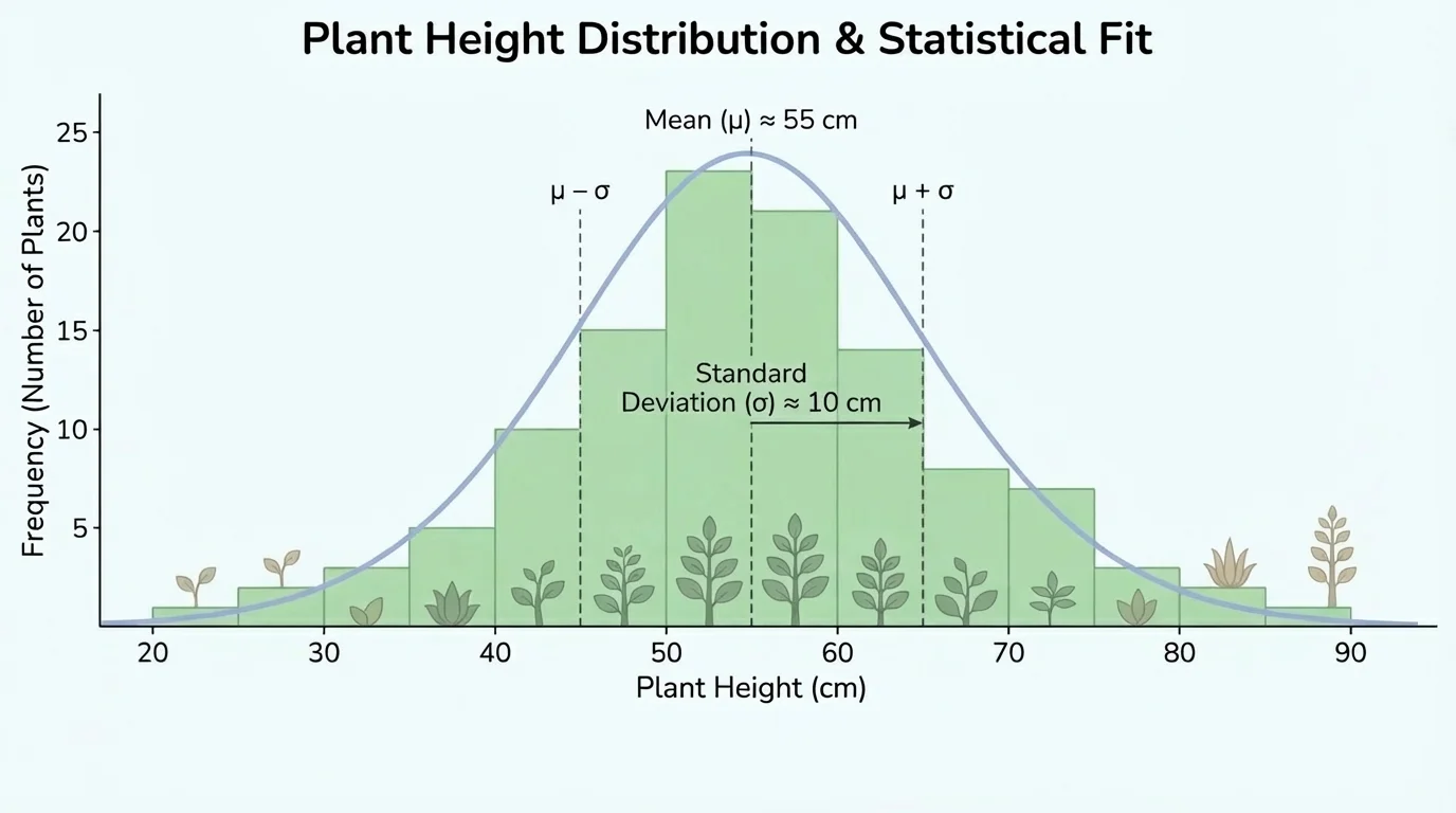
When scientists collect data from many organisms, they need ways to summarize the pattern. A mean gives the average value. The range shows how spread out the values are. A frequency table or graph shows how often each value or category appears. In population studies, the overall shape of the distribution matters, as [Figure 2] shows for a continuous trait.
For a continuous trait like plant height, many individuals may cluster near the center, with fewer at the extremes. That kind of pattern often appears when the trait is influenced by several genes and by environmental conditions. By contrast, a single-gene trait with only two forms may produce separate categories rather than a smooth spread of values.
Consider the heights, in centimeters, of \(8\) plants: \(12\), \(15\), \(14\), \(16\), \(15\), \(13\), \(17\), and \(14\). The mean is
\[\frac{12+15+14+16+15+13+17+14}{8} = \frac{116}{8} = 14.5\]
The range is
\(17 - 12 = 5\)
These two numbers already tell us something useful: the center is around \(14.5\) centimeters, and the heights spread across \(5\) centimeters.
Scientists also use proportions and percentages. If \(36\) out of \(120\) plants show purple flowers, the proportion is \(\dfrac{36}{120} = 0.30\), which is \(30\%\). This is often more useful than the raw count because it allows comparisons between groups of different sizes.
| Group | Total plants | Purple flowers | Proportion purple |
|---|---|---|---|
| Field A | \(120\) | \(36\) | \(0.30\) |
| Field B | \(80\) | \(32\) | \(0.40\) |
Table 1. Comparison of purple-flower frequency in two plant groups using proportions.
Even though Field A has more purple plants in total, Field B has the higher proportion. This is why percentages and proportions are central in genetics and population biology.
Human blood types are an example of trait distribution that can differ sharply among populations. Scientists track these frequencies to study inheritance, migration patterns, and medical compatibility.
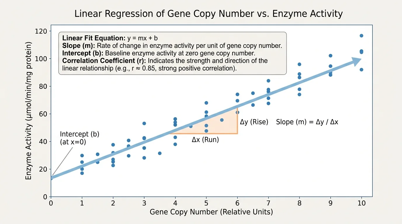
[Figure 3] Sometimes scientists are not just counting trait frequencies. They want to know whether one variable changes in relation to another. A scatter plot helps reveal whether two variables appear related. Each point represents one observation, such as one organism, one sample, or one trial.
If the points trend upward from left to right, the relationship is positive: when one variable increases, the other tends to increase. If the points trend downward, the relationship is negative. If the points are scattered without a clear pattern, the relationship may be weak or absent.
When a straight-line model fits the data reasonably well, scientists use a linear equation of the form
\(y = mx + b\)
Here, \(m\) is the slope, which tells how much \(y\) changes for each unit increase in \(x\). The value \(b\) is the intercept, the predicted value of \(y\) when \(x = 0\).
Suppose biologists measure gene copy number \(x\) and enzyme activity \(y\). A digital tool gives the linear fit \(y = 2.5x + 1.0\). The slope \(2.5\) means enzyme activity increases by about \(2.5\) units for each additional copy. The intercept \(1.0\) means the model predicts enzyme activity of \(1.0\) when the copy number is \(0\).
Interpreting a linear fit
A scientist models the relationship between leaf nitrogen content \(x\) and growth rate \(y\) with \(y = 1.8x + 0.6\).
Step 1: Identify the slope.
The slope is \(1.8\).
Step 2: Interpret the slope.
For each increase of \(1\) unit in nitrogen content, the growth rate increases by about \(1.8\) units.
Step 3: Identify the intercept.
The intercept is \(0.6\).
Step 4: Interpret the intercept.
When \(x = 0\), the model predicts a growth rate of \(0.6\).
This does not automatically mean the prediction is biologically realistic. Scientists must still ask whether \(x = 0\) makes sense in the real system.
Another important measure is the correlation coefficient, often written as \(r\). This number describes the strength and direction of a linear relationship. Values of \(r\) near \(1\) indicate a strong positive linear relationship. Values near \(-1\) indicate a strong negative linear relationship. Values near \(0\) indicate little or no linear relationship.
For example, if data on allele frequency and altitude produce \(r = 0.92\), that suggests a strong positive linear association. If a study of two variables gives \(r = -0.81\), that suggests a strong negative linear association. If the value is \(r = 0.08\), the linear relationship is extremely weak.
Still, correlation does not prove causation. Two variables may change together because one causes the other, because both are affected by a third factor, or by coincidence. That warning matters in genetics, medicine, and engineering.
Not all scientific data are best described by a line. Choosing a function fit means selecting a mathematical model whose shape matches the pattern in the data. As [Figure 4] shows, some biological data curve upward or level off, so a non-linear model may be more appropriate than a linear one.
Bacterial population growth is a classic example. Early in growth, the number of cells may increase more and more quickly, which is better modeled by an exponential curve than by a straight line. In another case, a population may grow rapidly at first and then level off as resources become limited, which is better represented by a logistic-type curve.
Scientists compare models by asking which one best matches the data and makes sensible predictions. A model should fit the pattern, but it should also connect to real biology or engineering. A curve may look impressive, but if it predicts impossible values, it is not useful.
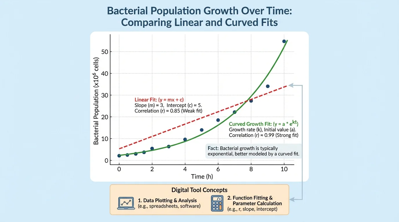
Suppose a bacterial culture has counts of \(100\), \(180\), \(330\), and \(610\) cells at equal time intervals. The increases are not constant, so a linear model is probably weak. The growth factors are more consistent: \(\dfrac{180}{100} = 1.8\), \(\dfrac{330}{180} \approx 1.83\), and \(\dfrac{610}{330} \approx 1.85\). That pattern suggests an exponential-type fit.
Why model choice matters
A linear fit assumes a constant rate of change. An exponential fit assumes change by a roughly constant factor. In biology, using the wrong model can lead to wrong predictions about population growth, gene expression, drug response, or material failure.
Later, when scientists compare treatment groups or engineering designs, they often return to the same question: do the data really follow a straight-line trend, or are we forcing a fitted linear model onto a curved pattern?
Modern science depends on digital tools because real data sets are often too large to analyze by hand. Spreadsheets, graphing calculators, and scientific software can quickly calculate means, generate graphs, find best-fit equations, and report values such as \(r\).
For example, a spreadsheet can take a list of plant heights and compute the mean automatically. It can sort trait counts into a frequency table, create a histogram, and add a trend line to a scatter plot. A graphing calculator can perform linear regression and output the values of \(m\), \(b\), and sometimes \(r\) or \(r^2\).
Digital tools save time, but they do not replace reasoning. A student or scientist still has to decide whether the data were collected fairly, whether outliers should be investigated, and whether the model is biologically meaningful.
Using a digital linear fit result
A graphing tool returns the equation \(y = -3.2x + 18.4\) with correlation coefficient \(r = -0.95\) for temperature \(x\) and dissolved oxygen \(y\) in water samples.
Step 1: Read the slope.
The slope is \(-3.2\), so dissolved oxygen decreases by about \(3.2\) units for each \(1\)-unit increase in temperature.
Step 2: Read the intercept.
The intercept is \(18.4\), so when \(x = 0\), the model predicts \(y = 18.4\).
Step 3: Interpret the correlation coefficient.
Because \(r = -0.95\), the linear relationship is very strong and negative.
This kind of analysis is common in environmental science and bioengineering.
Statistical results are useful only when interpreted with care. A high correlation may still hide important complications. A mean may hide extreme variation. A trait ratio that looks unusual may come from small sample size rather than a broken theory.
Scientists therefore ask several questions: Was the sample large enough? Was it representative? Were measurements consistent? Are there outliers? Does the model make biological sense? Could another variable explain the pattern?
For example, if a study finds a relationship between plant growth and fertilizer amount, sunlight may also matter. If one group of plants received more water, then the data may reflect multiple changing variables, not just one. Good science tries to control variables and repeat trials.
"The data are not enough. We must also understand what question the data can answer."
This is especially important in heredity. A trait may run in families, but environment can still influence whether and how strongly the trait is expressed. Statistical patterns can support a genetic explanation without making the trait completely predictable for every individual.
In agriculture, breeders use probability to predict trait combinations and statistics to decide whether a crop line is stable. If a new strain of corn is expected to show drought resistance in \(75\%\) of offspring, repeated trials across many plants help determine whether the observed proportion matches the prediction closely enough.
In medicine, researchers compare how often gene variants appear in people with and without a disease. They may graph dosage against response, use a best-fit line to estimate trends, and test whether a relationship is strong enough to be meaningful. Personalized medicine depends on these statistical patterns.
In ecology, scientists track distributions of traits such as shell thickness, fur color, or flowering time. A shift in the distribution can signal natural selection, environmental stress, or migration. The histogram pattern we discussed earlier, as seen in [Figure 2], becomes evidence about how a population is changing over time.
In bioengineering, researchers test materials used in artificial joints, stents, or tissue scaffolds. They may examine whether thickness is linearly related to strength, whether wear increases over time, or whether a curved model better predicts failure. Here, the same ideas of slope, intercept, correlation, and function fit guide practical design decisions that affect human health.
Whether the question involves pea plants, human genetics, or engineered biomaterials, the overall strategy is the same: collect reliable data, choose appropriate tools, model the pattern, and interpret the result with scientific caution.