Have you ever noticed that some things change in a steady way while others change in a surprising way? If you walk at the same speed, the distance you travel grows steadily over time. But if you watch a small plant grow, it may grow slowly at first and then faster later. Graphs help us see these patterns quickly. They turn lists of numbers into pictures we can understand.
When scientists, engineers, coaches, and business owners collect information, they often start with numbers. A weather scientist may record temperature each hour. A coach may track how many laps a runner finishes each day. A store owner may count how many customers come in each hour. A graph helps organize these numbers so we can look for a pattern.
Graphs are part of analyzing and interpreting data because they help us answer questions such as: Is the amount increasing? Is it changing steadily? Is there a surprising point? Graphs are also part of developing and using models because a graph can act like a model of what is happening in the real world. It does not show every detail, but it shows the important pattern.
You already know how to read a number line, compare numbers, and place points using ordered pairs such as \(2, 5\). Those ideas are important when making and reading graphs.
A graph can help us answer questions more quickly than a long list of numbers can. For example, if a table shows the temperatures for \(6\) hours, you can read all the numbers one by one. But on a graph, you can quickly notice whether the temperature rises, falls, or stays almost the same.
Data are pieces of information that we collect. Data can be numbers, such as how many pages you read each day, how tall a plant is each week, or how much rain falls each month. A graphical display is a visual way to show data. One common graphical display is a graph on a coordinate plane with labeled axes, equal intervals, and plotted points.
Many graphs use two variables. A variable is something that can change. In a graph about distance walked over time, time is one variable and distance is the other. The horizontal axis is called the x-axis, and the vertical axis is called the y-axis. The numbers on the axes must follow a clear scale, which means equal spaces stand for equal amounts.
Each point on the graph matches an ordered pair. An ordered pair looks like \(x, y\). The first number tells where to move along the \(x\)-axis, and the second number tells where to move up or down on the \(y\)-axis. If the ordered pair is \(3, 4\), move \(3\) units across and \(4\) units up.
A table and a graph often show the same data in different ways. The table gives exact values in rows and columns. The graph gives a picture of the pattern. Both are useful. We often start with a table and then create a graph.
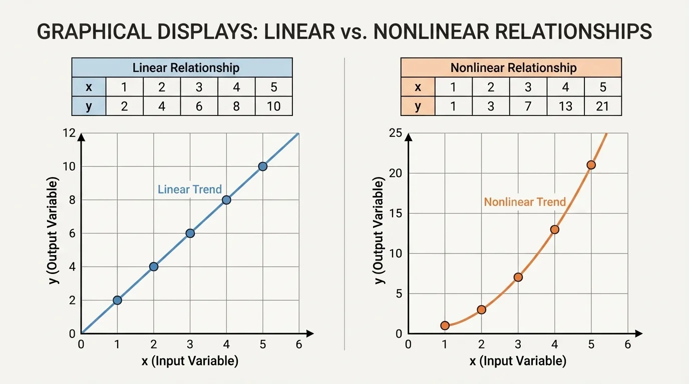
Linear relationship means the data points follow a straight-line pattern. The amount changes at a steady rate.
Nonlinear relationship means the data points do not follow one straight-line pattern. The amount changes, but not at a steady rate.
Trend is the general pattern the data follow, such as increasing, decreasing, or staying about the same.
When we study a graph, we are not only reading single points. We are looking at the whole picture. Are the points climbing upward? Are they dropping downward? Do they form a straight path or a curve? These are the clues that help us identify the kind of relationship.
To construct a graph, begin with a data table. Suppose a student records the number of minutes spent reading each day for \(5\) days. The table might show day \(1\): \(10\) minutes, day \(2\): \(20\) minutes, day \(3\): \(30\) minutes, day \(4\): \(40\) minutes, and day \(5\): \(50\) minutes.
First, decide which variable goes on each axis. Usually, the variable that changes in order, such as time or day number, goes on the \(x\)-axis. The other variable goes on the \(y\)-axis. In this example, day number goes on the \(x\)-axis and reading minutes go on the \(y\)-axis.
Next, choose a scale that fits the data well. If the reading times are \(10, 20, 30, 40, 50\), the \(y\)-axis might count by \(10\)s. Then label both axes clearly. After that, plot each ordered pair: \(1, 10\), \(2, 20\), \(3, 30\), \(4, 40\), and \(5, 50\).
Finally, check your graph. Are the axis labels correct? Are the intervals equal? Are the points in the right places? A graph with a wrong scale or missing labels can lead to wrong conclusions.
Choosing a good scale matters because it changes how easy the graph is to read. If the scale is too small, points are crowded together. If it is too large, the pattern may be hard to notice. A good scale uses the space well and keeps equal intervals equal.
Sometimes students think graphing is just plotting points, but careful graphing is really about showing data clearly. A well-made graph helps people interpret the information correctly.
After a graph is made, the next job is interpretation. To interpret a graph means to explain what the data show. You might describe whether the values rise, fall, or stay level. You might compare one point to another. You might decide whether the pattern is linear or nonlinear.
If the points rise from left to right, the graph shows an increasing pattern. If the points fall from left to right, the graph shows a decreasing pattern. If the points stay close to the same height, there is little change. We also look to see whether the changes are steady or not steady.
A steady change means equal steps in one variable lead to equal steps in the other variable. For example, if every increase of \(1\) hour means the distance increases by \(4\) kilometers, the change is steady. If the increases are \(2\) kilometers, then \(5\), then \(9\), the change is not steady.
Many digital tools, from fitness watches to weather apps, create graphs automatically. Even when a computer makes the graph, people still need to understand the pattern and decide what it means.
Looking for patterns helps us move from "What numbers do we have?" to "What story do these numbers tell?" That is a powerful part of data analysis.
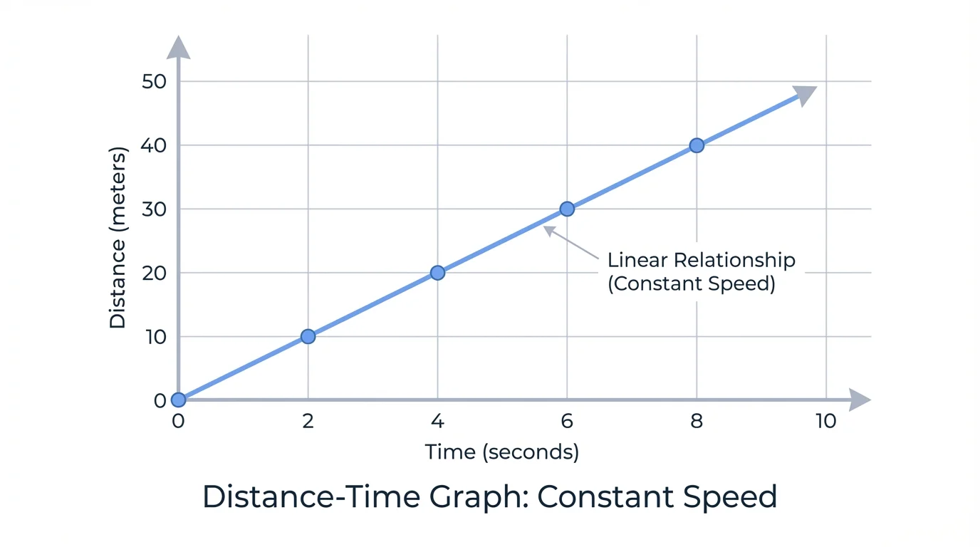
A linear relationship appears when points follow a straight-line pattern, such as in a distance-and-time graph for constant walking speed. This happens when the amount changes by equal differences over equal intervals. In simpler terms, the graph increases or decreases steadily.
Suppose you walk at a steady speed of \(3\) meters each second. After \(1\) second, you travel \(3\) meters. After \(2\) seconds, \(6\) meters. After \(3\) seconds, \(9\) meters. The distances increase by \(3\) each time. Because the change is constant, the points line up in a straight pattern.
A linear relationship does not have to increase. It can also decrease. For example, if a tank loses \(2\) liters of water each minute, the amount of water goes down steadily. That graph would show a straight-line pattern slanting downward.
When you study a linear graph, you can often make simple predictions. If the pattern continues, and distance increases by \(3\) meters every second, then after \(4\) seconds the distance would be \(12\) meters, and after \(5\) seconds it would be \(15\) meters. That makes graphs useful as models.
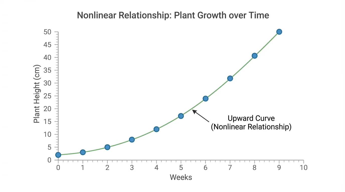
A nonlinear relationship appears when points do not form one straight-line pattern. Instead, they may curve, bend, or change direction. A graph of plant growth over several weeks can rise in a curved pattern when the plant grows slowly at first and faster later.
Imagine a plant with heights of \(2\), \(3\), \(5\), \(8\), and \(12\) centimeters over \(5\) weeks. The increases are \(1\), then \(2\), then \(3\), then \(4\). Because the increases are not equal, the relationship is not linear.
Another example is a ball thrown upward. Its height changes over time, but not at a constant rate. At first the ball rises, then it slows, then it stops for a moment, and then it falls. The graph of height versus time is curved, not straight.
Nonlinear graphs are common in nature and science. Temperature changes during a day, population growth, and the way a puddle evaporates can all produce nonlinear patterns. This is why it is important not to assume every graph should look like a straight line.
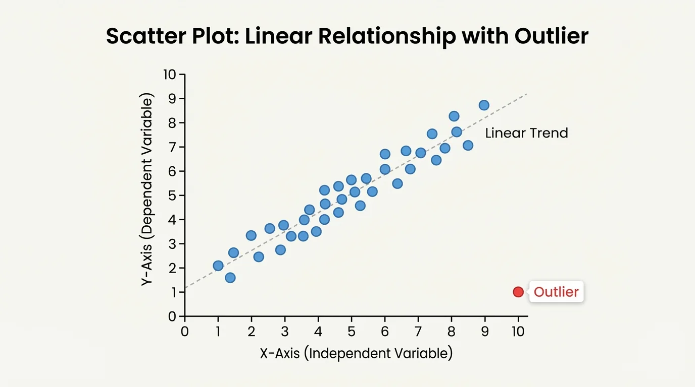
Good graph readers look for the overall trend, but they also notice unusual points. One point that does not fit the pattern is called an outlier. An outlier might happen because of a measuring mistake, or it might show that something unusual really happened.
Suppose most points show that as study time increases, quiz scores also increase. But one point shows a very low score after a long study time. That point might be an outlier. Maybe the student was sick during the quiz, or maybe the data were entered incorrectly. We should notice it and think carefully before drawing conclusions.
We also need to read the scale carefully. If one graph counts by \(1\)s and another counts by \(10\)s, the same data can look different. The scale does not change the data, but it changes how the graph appears.
As we saw with the plant graph in [Figure 3], a curved pattern means the change is not constant. As we saw with the walking graph in [Figure 2], a straight pattern suggests steady change. Looking at both the trend and the details helps us interpret correctly.
A graph can be a model. A model is a representation of something real. A toy car can model a real car. A map can model a real place. A graph can model how one quantity changes with another.
For example, if you graph the amount of money saved each week, the graph models your saving pattern. If you add the same amount each week, the graph may be linear. If you save different amounts each week, the graph may be nonlinear. The graph helps you predict what may happen later if the pattern continues.
Graphs as tools for prediction work best when the pattern is clear and the data are trustworthy. If a relationship looks linear, we can often estimate nearby values by following the straight-line pattern. If it is nonlinear, we can still make careful predictions, but we must remember that the change is not constant.
Models are useful because they simplify complicated situations. A graph cannot show every reason why a plant grows or why a runner slows down, but it can show the pattern of change clearly enough to help us think and decide.
Worked examples show how to move from raw data to a clear conclusion about the relationship.
Worked Example 1: Classify a relationship from a table
A toy car travels these distances in equal time intervals:
At \(1\) second: \(2\) meters, at \(2\) seconds: \(4\) meters, at \(3\) seconds: \(6\) meters, at \(4\) seconds: \(8\) meters.
Step 1: Look at how the distance changes.
The distances are \(2, 4, 6, 8\). The increases are \(4 - 2 = 2\), \(6 - 4 = 2\), and \(8 - 6 = 2\).
Step 2: Decide whether the change is constant.
Each time interval adds \(2\) meters. The change is constant.
Step 3: Classify the relationship.
Because equal time steps give equal distance increases, the relationship is linear.
Answer: The data show a linear relationship.
This example matches the kind of straight-line pattern seen earlier in [Figure 2]. Constant change is the big clue.
Worked Example 2: Identify a nonlinear relationship
A candle burns and its height is measured each hour:
Hour \(1\): \(12\) cm, hour \(2\): \(10\) cm, hour \(3\): \(7\) cm, hour \(4\): \(3\) cm.
Step 1: Find the changes in height.
The changes are \(10 - 12 = -2\), \(7 - 10 = -3\), and \(3 - 7 = -4\).
Step 2: Compare the changes.
The height does not decrease by the same amount each hour.
Step 3: Classify the graph.
Because the changes are not equal, the graph will not form one straight-line pattern.
Answer: The data show a nonlinear relationship.
Notice that the values are decreasing, but they are not decreasing steadily. A graph can go downward and still be nonlinear if the amount of change keeps changing.
Worked Example 3: Read a point and describe the trend
A graph shows the number of pages read over \(5\) days. One plotted point is \(3, 45\), and the points rise in a straight-line pattern.
Step 1: Interpret the ordered pair.
The point \(3, 45\) means that on day \(3\), \(45\) pages were read.
Step 2: Describe the trend.
The points rise from left to right, so the number of pages read is increasing.
Step 3: Decide on the relationship type.
Because the pattern is straight, the relationship is linear.
Answer: Day \(3\) has \(45\) pages, the trend is increasing, and the relationship is linear.
Understanding a single point and the overall pattern together is an important graph-reading skill. One tells you an exact value; the other tells you the bigger story.
Worked Example 4: Make a simple prediction from a linear graph
A graph shows that a student saves \(5\) dollars each week. After \(1\) week the student has \(5\) dollars, after \(2\) weeks \(10\) dollars, and after \(3\) weeks \(15\) dollars.
Step 1: Find the constant change.
The savings increase by \(5\) dollars each week.
Step 2: Extend the pattern.
After \(4\) weeks, the amount is \(15 + 5 = 20\) dollars.
Step 3: State the prediction.
If the pattern continues, the point for week \(4\) is \(4, 20\).
Answer: The student will have \(20\) dollars after \(4\) weeks.
Predictions are part of using a graph as a model. They are most reliable when the data pattern is clear and steady.
Graphs appear everywhere. In sports, a graph can show how many points a basketball player scores each game. In science, a graph can show how shadows change length during the day. In weather reports, graphs show changes in temperature, rainfall, or wind speed.
Stores and businesses use graphs to study how sales change over time. Doctors and nurses use graphs to monitor height, weight, or heart rate. Engineers use graphs to test how materials bend or how machines perform. In each case, people collect data, display it, and then interpret the pattern.
| Situation | Possible Variables | Possible Relationship |
|---|---|---|
| Walking at a steady speed | Time and distance | Usually linear |
| Plant growth | Weeks and height | Often nonlinear |
| Saving the same amount weekly | Weeks and money saved | Linear |
| Cooling hot soup | Time and temperature | Often nonlinear |
Table 1. Examples of real-world situations that can produce linear or nonlinear graphs.
The coordinate plane shown earlier in [Figure 1] is the basic tool for building these models, while the outlier shown in [Figure 4] reminds us to check whether every point fits the pattern. Good decisions depend on careful graph reading.
"The numbers may be small, but the pattern can reveal something big."
When you construct and interpret graphs, you are doing more than drawing dots. You are turning information into evidence. You are noticing whether change is steady or changing. You are using data to understand the world.