A pilot planning a flight, a farmer waiting for monsoon rains, and a logistics team choosing a sea route all depend on the same skill: reading maps carefully enough to anticipate what is likely to happen next. Maps do much more than show where places are. They help us answer questions, solve problems, and make decisions. In geography, a good map reader can look at patterns of landforms, climate, population, and resources and draw well-supported conclusions about how people live in a place.
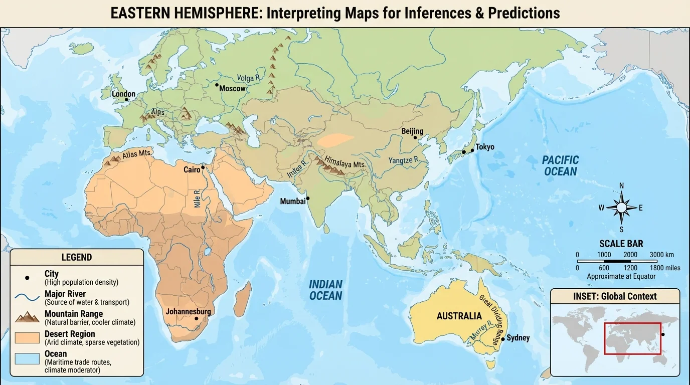
This skill is especially important when studying the Eastern Hemisphere, including regions such as Africa, Europe, Asia, and Australia. These regions contain deserts, river valleys, mountain barriers, crowded cities, islands, grasslands, and major trade routes. When geographers study them, they do not just memorize locations. They examine maps to understand relationships between people and places.
When you interpret a map, you move beyond simple observation. If a map shows that most cities in Egypt are near the Nile River, you can infer that water is essential for settlement there. If a climate map shows seasonal wind patterns and rainfall in South Asia, you can predict when farming conditions will improve or when flooding may become more likely. That is the difference between reading a map and thinking like a geographer.
Map interpretation connects directly to real life. Governments use maps to plan roads and railways. Scientists use them to track droughts and storms. Businesses use them to decide where to open ports or factories. Aid groups use them to predict which areas may face food shortages after failed rains. In every case, the map is evidence, and the user must make a reasoned judgment based on that evidence.
Remember that geography asks not only where something is, but also why it is there, how it affects people, and what may happen because of it. Maps help answer all four questions.
To make strong inferences and predictions, you need to notice patterns. A pattern might be a line of cities along a coast, farms clustered in a river valley, sparse settlement in dry lands, or trade routes passing through narrow waterways. Once you see a pattern, you ask what caused it and what it suggests about the future.
Every map contains clues, as shown in [Figure 1], and reading those clues carefully is the first step in interpretation. Before making any inference, check the map's title, legend, scale, compass rose, labels, and source. These tell you what the map is about, how symbols work, how far distances are, what direction places lie in, and where the information came from.
A legend explains symbols and colors. A scale helps you estimate distance. A compass rose shows direction. The title tells you the map's focus. If the title says "Population Density of East Asia," then the map is not mainly about climate or elevation. If you ignore the title, you may draw the wrong conclusion.
Maps also use symbols, shading, and color to represent information. Darker color may mean more rainfall, higher population, or greater elevation depending on the map. That is why the legend matters. Geographers do not guess what colors mean; they verify them.
Source and date matter too. A map of political boundaries from one year may not match another year if countries split, merged, or changed borders. A rainfall map from a wet year could give a different picture than a long-term climate map. Strong interpretation always asks, "When was this map made?" and "Who created it?"
Inference is a conclusion based on evidence and reasoning rather than a direct statement. Prediction is a statement about what is likely to happen in the future based on patterns and evidence. In geography, both depend on careful use of map data.
If a map shows roads crossing a mountain pass, that does not directly state "this pass is important for travel." But you can infer it because roads usually follow routes that are possible and useful. If several roads and rail lines meet there, you can also predict that trade and movement will continue to be concentrated in that area.
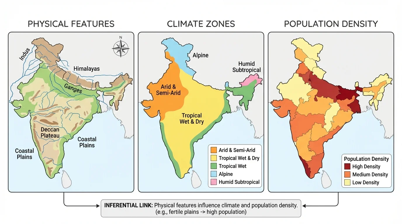
The same region can tell very different stories depending on the map type, as [Figure 2] illustrates. A political map highlights countries, capitals, and borders. A physical map shows landforms such as mountains, rivers, plains, and deserts. A climate map displays temperature and precipitation patterns. A population map shows where people are concentrated. A resource map identifies things such as oil, natural gas, forests, or minerals. A transportation map focuses on roads, railways, ports, and shipping routes.
A political map might show that India borders Pakistan, China, Nepal, and Bangladesh. A physical map adds that the Himalayas form a major barrier in the north. A climate map reveals monsoon rainfall patterns. A population map shows that many people live in river valleys and coastal plains. Each map provides part of the story, but no single map explains everything.
Geographers often compare maps. For example, if you place a physical map next to a population map, you may notice that densely populated areas often appear on flat land, near water, or in regions with moderate climate. If you compare a resource map with a transportation map, you may see ports and rail lines linking areas rich in resources to industrial regions or global markets.
Some maps are thematic maps, meaning they focus on one topic. A thematic map might show language groups in Central Asia, earthquake zones around Japan, or major oil fields in Southwest Asia. Thematic maps are powerful because they help you notice one pattern clearly, but they are strongest when used with other maps.
One important skill is distinguishing what a map shows directly from what you conclude indirectly. A physical map directly shows mountains. From that, you may infer that transportation is more difficult there than on a plain. A climate map directly shows arid conditions. From that, you may infer that farming without irrigation is difficult.
| Map Type | What It Shows Directly | Possible Inferences | Possible Predictions |
|---|---|---|---|
| Political | Borders, capitals, countries | Neighboring states may interact or conflict | Border regions may be important for trade or security |
| Physical | Mountains, rivers, deserts, plains | Landforms affect travel and settlement | People will likely cluster where land and water support life |
| Climate | Temperature and rainfall patterns | Climate shapes crops and daily life | Droughts or floods may affect regions with extreme conditions |
| Population | Dense and sparse settlement | People gather near jobs, water, or fertile land | Crowded regions may need more housing and transport |
| Resource | Oil, gas, minerals, forests | Resources influence trade and industry | Ports, pipelines, or roads may expand near resource zones |
Table 1. Comparison of common map types, the evidence they provide, and the inferences and predictions they support.
A pattern is a repeated arrangement or relationship that appears across a map. Patterns are the foundation of inference. If cities line up along coasts, rivers, or trade routes, that is not random. It suggests that water access, transportation, and trade matter. If populations are sparse in deserts or very high mountains, that suggests environmental limits on settlement.
Strong inferences use map evidence and background knowledge together. Suppose a map of Europe shows many major cities located on navigable rivers such as the Rhine or Danube. From this, you can infer that rivers support transportation, trade, and urban growth. The map may not say "rivers caused city growth," but the pattern strongly supports that idea.
You can also infer human choices from natural features. If a transportation map in Central Asia shows routes bending around mountain ranges, you can infer that builders choose flatter, safer paths when possible. If ports are concentrated along sheltered coasts instead of rocky, stormy shores, you can infer that geography affects where ships can dock safely.
Evidence-based geographic reasoning means using at least two clues from a map, or from several maps, to support a conclusion. A strong statement sounds like this: "Because the area has a river, fertile plain, and dense settlement, it is likely that it is an important farming region." A weak statement sounds like this: "I think people just like living there."
Good inferences are careful, not absolute. A map may suggest that a desert has low population, but it does not mean nobody lives there. It may suggest that a river valley is fertile, but not every part of the valley is farmed. Geographers avoid overgeneralizing and stay close to the evidence.
Predictions are about what is likely, not what is guaranteed. To make a prediction, geographers look for current conditions, repeated patterns, and connections between factors. If a map shows rapid urban growth around Lagos or Mumbai and transportation routes already under pressure, you can predict that these cities may need expanded infrastructure, more housing, and improved services.
A useful prediction often begins with words such as likely, may, or is expected to. That language shows that the statement is based on evidence but still allows for change. Weather, technology, politics, and natural disasters can always alter outcomes.
Suppose a climate map shows a region of East Africa receiving below-average rainfall and a vegetation map shows grassland rather than dense forest. You might predict increased drought stress if dry conditions continue. If a population map also shows many people depending on farming or herding there, the prediction becomes stronger because human activity depends heavily on rainfall.
Case example: using one map set to build a prediction
A geographer compares a physical map, climate map, and population map of northeastern China.
Step 1: Notice the physical setting
The region includes broad plains and river systems, which support transportation and farming.
Step 2: Add climate evidence
The climate is more suitable for agriculture than colder or drier regions farther west and north.
Step 3: Add population evidence
The population map shows heavier settlement in the plains than in surrounding uplands.
Step 4: Make the prediction
Because flat land, water access, and large population already occur together, the region is likely to remain an important center of farming, transportation, and industry.
Notice that the prediction is not random. It grows from a chain of evidence. Good geographic predictions are like that: they connect map clues logically.
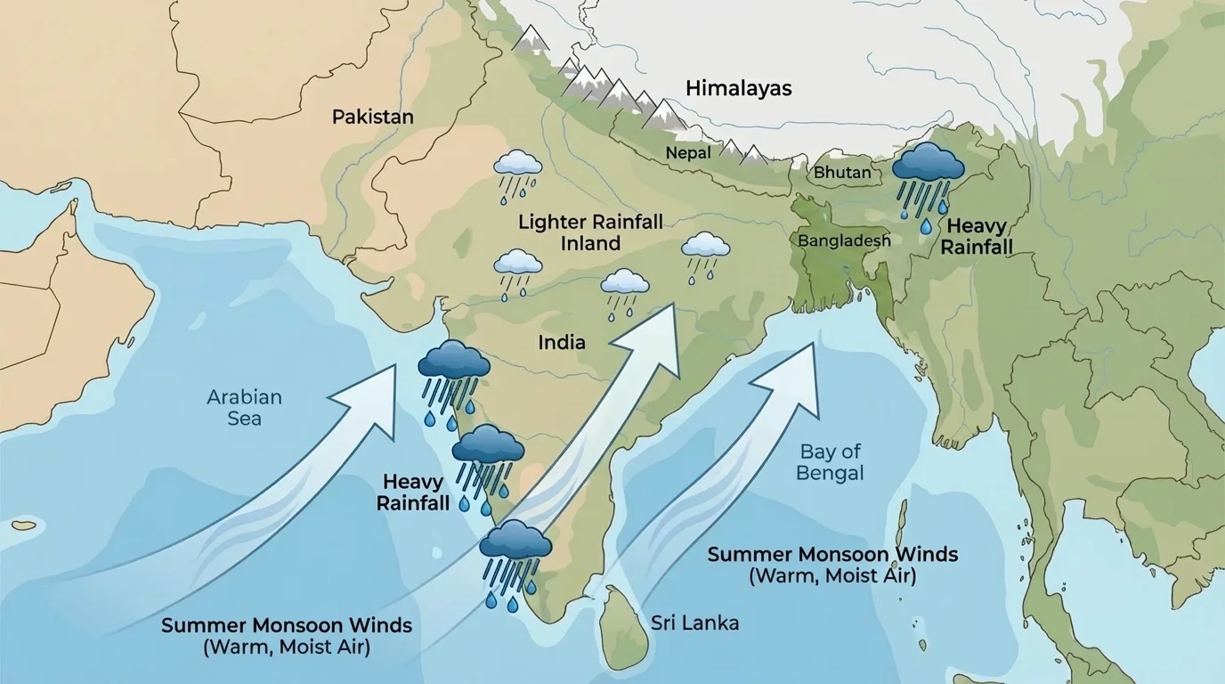
[Figure 3] South Asia provides one of the clearest examples of map-based prediction. The connection between wind direction, ocean moisture, and rainfall is especially important here. In summer, monsoon winds blow from the Indian Ocean toward the land. Areas along the western coast of India and parts of northeastern India receive heavy rainfall, while some inland areas receive less. By reading climate and wind maps together, geographers can predict where crops will grow well, where flooding risk is greater, and where water shortages may occur if the monsoon weakens.
This matters because millions of people depend on monsoon rains. If the seasonal pattern arrives late or weakly, farmers may plant later, harvest less, or depend more on irrigation. A map showing the usual monsoon pattern helps people prepare even before the rains begin.
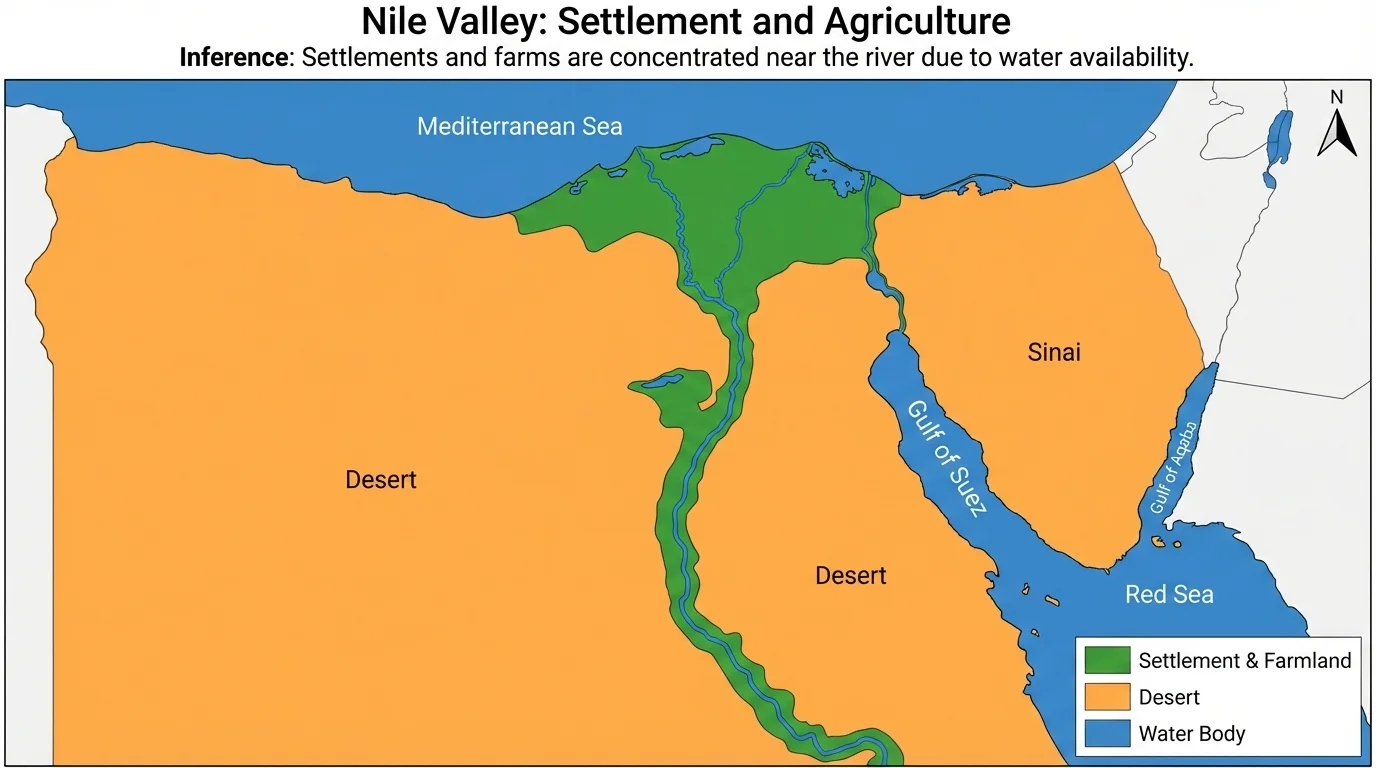
[Figure 4] In northeastern Africa, the Nile Valley gives another powerful example. It shows a narrow ribbon of settlement through a largely desert region. A physical map of Egypt shows desert on both sides of the Nile, while a population map shows dense settlement clustered along the river and delta. From this, we can infer that reliable access to water and fertile soil strongly shape where people live.
We can also predict that pressure on land and water resources will remain high in this region because so much of the population is concentrated in a relatively small habitable area. If population grows while usable land remains limited, competition for space, housing, and water may increase.
Japan offers a different case. A physical map shows mountainous terrain and limited flat land. A population map shows very large urban areas concentrated on coastal plains. From these maps, we infer that people crowd into the smaller areas suitable for large-scale settlement, transportation, and industry. We can predict continued dependence on efficient transportation networks and carefully planned urban space.
The Sahara and the nearby Sahel also reveal important patterns. A climate map shows extreme dryness in the Sahara and somewhat more seasonal rainfall in the Sahel. A population map shows very low density across much of the desert but somewhat greater settlement near water sources or on the desert's edges. From that, geographers infer that water availability controls much of human activity. If rainfall decreases in the Sahel, we can predict greater pressure on farming, grazing, and migration.
Trade maps of Europe and Asia reveal another kind of pattern. Major ports often sit on coasts, river mouths, or narrow sea passages. When shipping maps show heavy traffic through places like the Suez Canal, Strait of Malacca, or Bosporus, we infer that these chokepoints are strategically important. We can predict that any disruption there may affect trade far beyond the local region. This is one reason map reading matters in economics and politics as well as physical geography.
The Strait of Malacca, between the Malay Peninsula and the Indonesian island of Sumatra, is one of the world's busiest shipping routes. A narrow waterway on a map can influence trade across much of Asia and beyond.
Earlier, in [Figure 3], we saw that monsoon winds and rainfall patterns are connected. The same kind of reasoning works in Africa with the Nile and in Japan with coastal plains: when physical features shape where water, farmland, and transportation are available, human settlement patterns often follow.
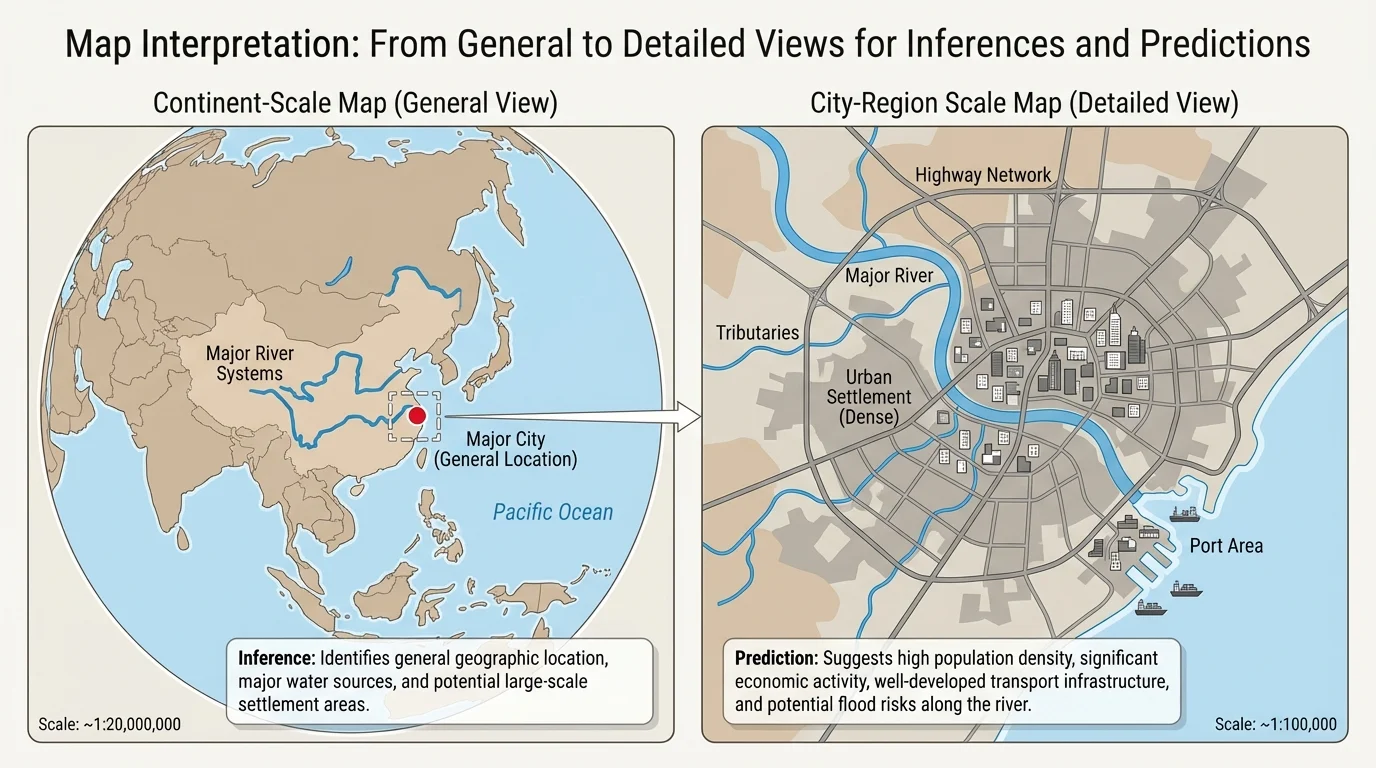
[Figure 5] Maps are powerful, but they are not perfect. A broad regional map can be compared with a more detailed local map to show how scale changes what details you can notice. A small-scale map covers a huge area and shows fewer details. A large-scale map covers a smaller area and shows more detail. If you are studying all of Asia, you may miss local roads, neighborhood patterns, or small rivers that become important on a city-level map.
The date of a map also matters. Population density, land use, transportation routes, and political borders can change over time. A map from ten or twenty years ago may not reflect new highways, urban growth, or environmental change. To make the best inference or prediction, geographers compare updated sources whenever possible.
Mapmakers also choose what to include and what to leave out. That choice shapes what the reader notices first. A climate map emphasizes temperature and rainfall, while a resource map highlights minerals or energy. Neither is wrong, but each is incomplete by itself. That is why geographers often cross-check information from more than one map.
Sometimes maps contain distortion. On flat world maps, areas near the poles can appear larger than they really are. Distances and directions may also vary depending on the map projection. That does not make the map useless, but it does mean careful readers must understand its purpose and limits.
Using multiple sources improves geographic reasoning. A strong conclusion may combine a physical map, climate map, satellite image, chart, or population map. When several sources point to the same idea, the inference becomes more trustworthy.
For example, if a physical map shows a river basin, a climate map shows seasonal rainfall, and a population map shows dense villages there, you have stronger evidence for the conclusion that the basin supports agriculture and settlement than you would from any one map alone.
One helpful method is to use a simple structure: observe, infer, predict. First, identify what the map directly shows. Next, explain what that evidence suggests. Then state what is likely to happen if the pattern continues. This keeps your reasoning organized and tied to evidence.
Here is a model: "The map shows dense population along the coast and major port cities. This suggests that trade and water access are important to settlement. Therefore, coastal regions are likely to remain centers of economic activity." Notice how each sentence builds on the previous one.
You can also strengthen your reasoning by combining at least two pieces of evidence. For example: "The map shows low rainfall and scattered settlement across the desert interior. Because water is scarce and farming is difficult, population growth there is likely to remain limited." This is more convincing than a statement based on one clue alone.
When geographers explain a conclusion, they often use words such as because, therefore, suggests, and likely. These words show the relationship between evidence and conclusion. They also make it clear whether you are stating a fact from the map or an interpretation based on the map.
Later, when you compare broad and detailed maps as in [Figure 5], you can see why good reasoning depends on choosing the right scale for the question. A continental map may help predict trade routes across regions, while a local map may better explain why a city grows in one exact place and not another.
Reading maps carefully turns geographic information into understanding. It allows us to explain why cities form where they do, why some areas farm successfully while others struggle, and why certain places become major trade hubs. Most importantly, it lets us use today's patterns to think intelligently about tomorrow's possibilities.