Have you ever noticed that weather forecasters do not just guess? They study numbers and patterns. If a town has many rainy days in spring but very few in summer, that pattern helps people decide when to plant gardens, plan picnics, or pack an umbrella. Learning to organize information in charts and graphs helps us turn lots of weather observations into ideas we can understand quickly.
Data is information we collect. In weather studies, data can include the number of sunny days, the amount of rainfall, the temperature, or how often it is windy. A page full of weather notes can be hard to read, but when that same information is placed in a table or graph, patterns become easier to see.
Scientists use data displays to answer questions such as: Which season is usually the wettest? Which month has the most sunny days? Does colder weather happen more often when there are more cloudy days? A good display helps us compare, count, and notice relationships.
A table is an organized way to show data in rows and columns. A bar graph is a graph that uses bars to compare amounts. A pictograph is a graph that uses pictures or symbols to represent data. A pie chart is a circle graph that shows how the whole is divided into parts. A pattern is something that repeats or changes in a way we can describe.
When we study weather over time, we are often looking for patterns in a particular season. For example, winter may have more snowy or cloudy days, while summer may have more sunny and warm days. Once we know the pattern, we can make a prediction, which is a careful guess based on evidence.
Weather data can be collected every day. A class might record the afternoon temperature, whether it was sunny or cloudy, and whether any rain fell. After several weeks, the class has enough information to organize and study.
Suppose students observe the weather for 14 spring days. They count 6 sunny days, 4 rainy days, 3 cloudy days, and 1 stormy day. The total number of days is \(6 + 4 + 3 + 1 = 14\). This total matters because graphs and charts must match the data exactly.
Before making graphs, remember how to count carefully, add category totals, and read labels. If the totals are wrong at the start, the graph will also be wrong.
Sometimes weather data uses numbers, such as a temperature of \(24\) degrees. Sometimes it uses categories, such as sunny, rainy, windy, or snowy. Both kinds of data can be shown in tables and graphs.
[Figure 1] A table is often the best place to start because it keeps data neat. Rows usually list times or dates, and columns usually show the kinds of information collected. In weather data, rows might show each day of the week, while columns show temperature, rainfall, and sky condition. This layout makes it easy to find details quickly.
Here is an example of a weekly weather table.
| Day | High Temperature | Rainfall | Sky |
|---|---|---|---|
| Monday | \(22\) | \(0\) | Sunny |
| Tuesday | \(21\) | \(2\) | Cloudy |
| Wednesday | \(19\) | \(5\) | Rainy |
| Thursday | \(23\) | \(0\) | Sunny |
| Friday | \(24\) | \(0\) | Sunny |
Table 1. A weekly weather table showing temperature, rainfall, and sky conditions.
From this table, we can answer questions. Which day had the most rain? Wednesday, with \(5\). Which sky condition happened most often? Sunny, on 3 days. The table gives exact information, which is useful before we turn the data into graphs.
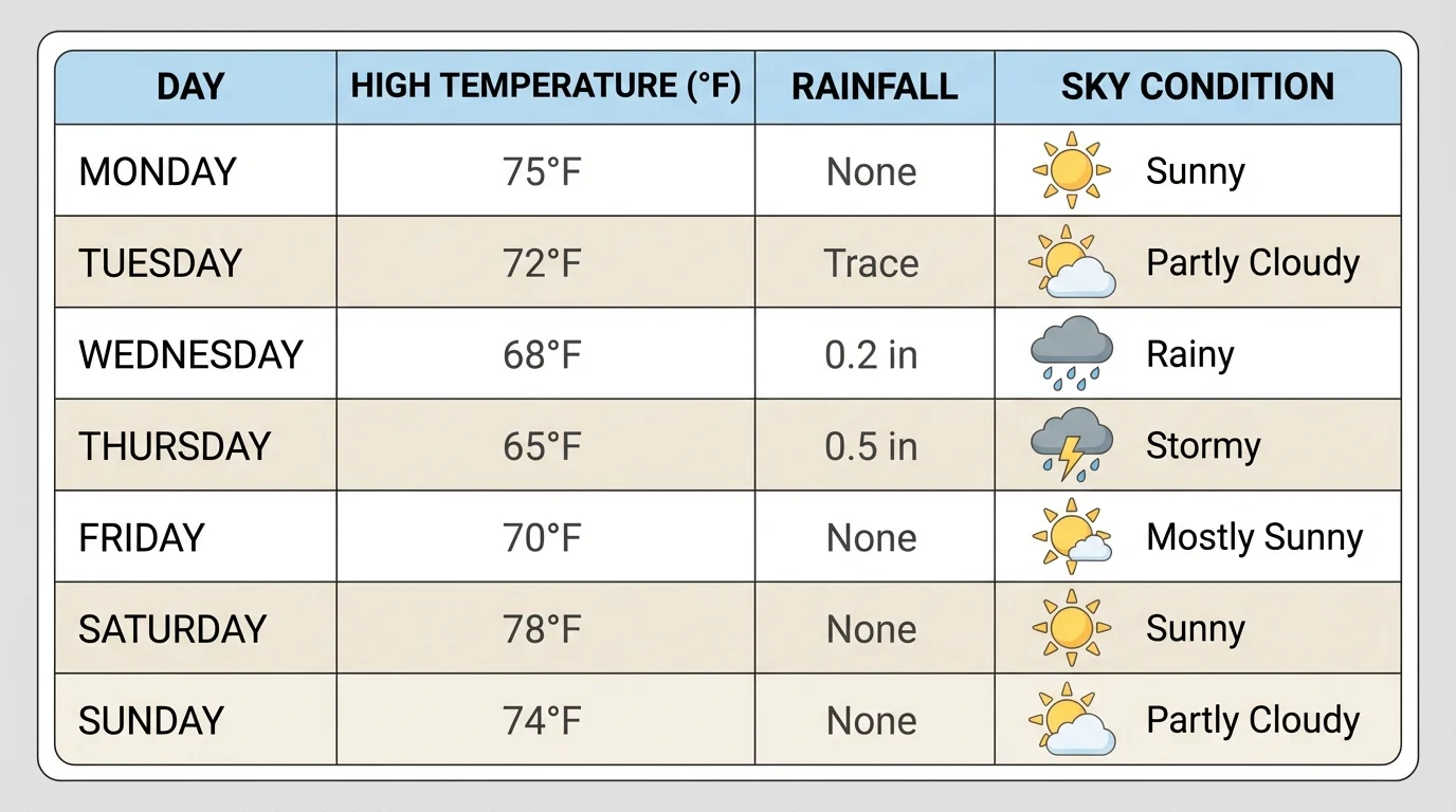
Tables are especially helpful when there are several types of data at once. A graph usually focuses on one comparison, but a table can hold many details together. Later, when we want to make a bar graph or pie chart, we often use the numbers from the table first.
[Figure 2] A bar graph is excellent for comparing amounts. Each bar stands for a category, such as sunny days, rainy days, or snowy days. The height or length of the bar shows how many there are. When one bar is taller than another, it means that category has a greater amount.
Suppose a class counts winter weather over 12 days: 2 sunny, 5 cloudy, 4 snowy, and 1 rainy. A bar graph would place the categories along one side and the numbers from \(0\) to at least \(5\) along the other side.
The tallest bar would be cloudy at \(5\). The next tallest would be snowy at \(4\). This quickly tells us that cloudy weather happened most often during that winter period. We can compare categories much faster than if we had to read many separate sentences.
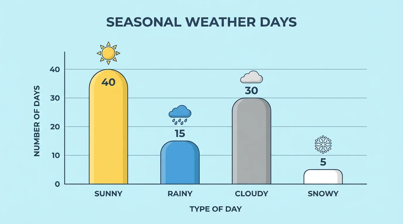
Bar graphs are useful when the categories are separate. A day cannot be both sunny and snowy in this simple count, so each day goes into one category. Later, if we compare another season, we may notice a relationship: winter has more snowy days, while summer has more sunny days. That relationship between season and weather is easier to notice on a graph than in a long list.
Worked example: Reading a bar graph
A bar graph shows fall weather with these counts: sunny \(= 4\), rainy \(= 6\), cloudy \(= 3\), windy \(= 2\).
Step 1: Find the greatest amount.
The largest number is \(6\), so rainy days happened most often.
Step 2: Compare two categories.
Rainy days compared with sunny days gives \(6 - 4 = 2\). There were \(2\) more rainy days than sunny days.
Step 3: Find the total.
Add all categories: \(4 + 6 + 3 + 2 = 15\).
The graph tells us that fall in this set of data was often rainy.
If you look back at the idea in [Figure 2], you can see why bar graphs are so powerful: the eye notices tall and short bars immediately. That visual difference helps us spot patterns quickly.
A pictograph uses pictures or symbols instead of bars. For example, one small sun symbol might stand for \(1\) sunny day. Or one cloud symbol might stand for \(2\) cloudy days. The key tells what each symbol means.
Pictographs are fun to read, but the key is very important. If one umbrella picture means \(2\) rainy days and you see 3 umbrellas, the total is \(3 \times 2 = 6\) rainy days. If the key is ignored, the data will be misunderstood.
Worked example: Using a pictograph key
A pictograph shows that one raindrop picture stands for \(2\) rainy days. There are 4 raindrop pictures.
Step 1: Read the key.
Each picture means \(2\) days.
Step 2: Count the symbols.
There are \(4\) symbols.
Step 3: Multiply.
\(4 \times 2 = 8\)
The pictograph represents 8 rainy days.
Pictographs work best when the numbers are not too large. They are especially helpful for younger readers because they turn numbers into pictures, but they still need accurate counting and a clear key.
[Figure 3] A pie chart shows how all the data fits together as one whole. The complete circle stands for the total number of observations, and each slice shows one part of that total. This makes it easier to see what share each weather type has in the whole set.
Suppose spring weather for 20 days includes 10 sunny, 5 rainy, 3 cloudy, and 2 stormy days. Sunny days are half of the total because \(10\) is half of \(20\). In fraction form, that is \(\dfrac{10}{20} = \dfrac{1}{2}\). So half of the pie chart would be the sunny section.
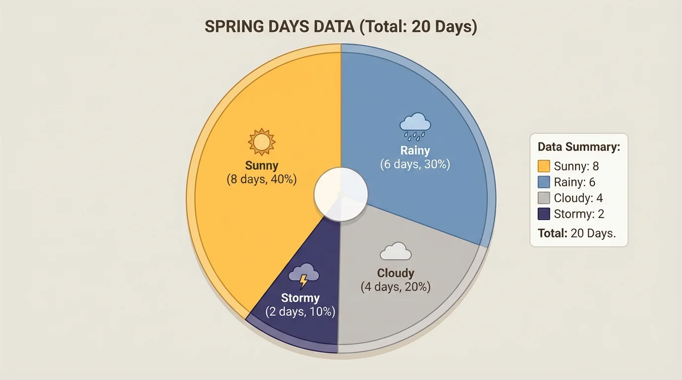
Rainy days would be \(\dfrac{5}{20} = \dfrac{1}{4}\) of the circle. Cloudy days would be \(\dfrac{3}{20}\), and stormy days would be \(\dfrac{2}{20} = \dfrac{1}{10}\). Pie charts are especially good for comparing parts to the whole, not just one category to another.
Parts and wholes in weather data
Bar graphs help us compare categories directly, but pie charts help us ask a different question: what part of all the days belonged to each kind of weather? This is useful when we want to know whether one weather type made up a small part, about half, or most of a season.
When you think again about [Figure 3], the largest slice stands out immediately. That helps us recognize which type of weather was most common in the season.
A pattern is something we notice happening again and again or changing in a clear way. In weather data, we might notice that summer usually has higher temperatures and more sunny days, while winter has lower temperatures and more snowy or cloudy days.
We also look for a relationship, which means a connection between two things. For example, there may be a relationship between season and the number of daylight hours, or between season and average temperature. As one changes, the other may change too.
If a table shows that the temperature in one city is often higher on sunny days than on rainy days, that is a relationship in the data. If a bar graph shows that spring has more rainy days than summer, that also reveals a relationship between season and weather conditions.
Some places have very strong seasonal patterns, while others do not. Near the equator, temperatures may stay fairly similar all year, but the amount of rain may still change from season to season.
Patterns do not mean that every single day will be the same. A warm winter day or a cool summer day can still happen. Data helps us understand what is typical, not what must happen every time.
A prediction is a statement about what is likely to happen based on evidence. If a town has had mostly dry, sunny weather in July for many years, it is reasonable to predict more sunny days in July than in January.
Predictions from data are stronger when they use many observations. For example, using 1 day of weather is not enough to describe a whole season. But using 30 days or many years of records gives a better picture of typical conditions.
Worked example: Making a seasonal prediction
A class studies weather records for the last 4 autumns. Each year, October has more rainy days than sunny days.
Step 1: Identify the repeated pattern.
Rainy days are more common than sunny days in October.
Step 2: Use the pattern as evidence.
Because the pattern appears in several years, it is probably typical for that place and season.
Step 3: State a prediction.
It is reasonable to predict that next October may also have many rainy days.
This is not a guarantee, but it is a well-supported prediction.
People use weather predictions every day. Farmers decide when to plant. Families plan outdoor events. Pilots and ship captains check patterns and forecasts to travel more safely. Students may even choose a coat or umbrella based on predicted conditions.
Weather graphs are not just for science notebooks. News stations show graphs to explain weekly temperatures. Gardeners use rainfall tables to know when plants may need extra water. City workers prepare snowplows when winter records show that snow is common in certain months.
Schools can also use weather data. If recess is often rained out in one season, teachers may plan more indoor activities. If summer temperatures are usually high, families may pack water bottles and hats more often. Data helps people make smart decisions.
Even animals respond to weather patterns. Birds may migrate when seasonal temperatures change. Plants may bloom when warmer spring weather becomes common. Scientists collect and graph this information to understand nature better.
One common mistake is forgetting labels. Every table and graph should make clear what the categories are and what the numbers mean. Without labels, readers cannot tell whether the graph is about days, temperatures, or rainfall.
Another mistake is using the wrong scale. If a bar graph counts up by \(2\) each time, readers must pay attention. A bar reaching the mark after \(4\) would mean \(6\), not \(5\), if the scale goes \(0, 2, 4, 6\).
Pictographs can be tricky when the key is not simple. If one symbol means \(5\) days, then 2 symbols mean \(10\) days because \(2 \times 5 = 10\). Pie charts can also be confusing if the slices do not add up to the whole set of data.
Checking totals helps prevent errors. If the table says there were 15 days of observations, then all the graph categories together should also equal \(15\). If they do not, something needs to be fixed.