A basketball player studies shot charts to improve scoring. A weather reporter studies temperature records to explain a heat wave. A doctor studies test results to assess a patient's health. In science, data works the same way: it helps us figure out what is happening and why. Data is not just a collection of numbers. When it is used to support a claim, it becomes evidence. When scientists analyze and interpret data, they use it to explain phenomena, which are events or patterns that happen in the natural world.
A phenomenon can be something small, like a puddle disappearing after rainfall, or something large, like birds migrating in winter. People may have guesses about why these things happen, but science depends on evidence. Evidence often comes from carefully collected data.
When scientists study a question, they do not stop after collecting information. They sort it, compare it, graph it, and look for patterns. Then they ask, "What does this tell us?" That step is called interpretation. Good interpretation turns raw information into understanding.
Data is information collected through observations, measurements, surveys, or experiments.
Analyze means to examine data carefully to find patterns, relationships, or important details.
Interpret means to explain what the data shows and what it might mean.
Phenomenon is something that happens or can be observed in nature.
Scientists use data because ideas need support. If someone says, "Plants grow better in sunlight," that is a claim. To make it scientific, the person needs evidence such as plant heights measured over time under different light conditions.
Data can come in different forms. Some data is qualitative, and some data is quantitative. Scientists often use both kinds together.
Qualitative data is information that describes qualities or characteristics. It may include color, smell, texture, sound, or behavior. For example, a student might record that one plant's leaves are yellow while another plant's leaves are dark green.
Quantitative data is information that can be measured or counted. It uses numbers. For example, a student might record that one plant is \(12 \textrm{ cm}\) tall and another is \(18 \textrm{ cm}\) tall.
An observation is something noticed with the senses, such as "the ice looks smaller after \(10 \textrm{ minutes}\)." A measurement gives a number, such as "the ice cube lost \(5 \textrm{ g}\) of mass." Observations are useful because they help scientists notice details that numbers alone may miss. Measurements are useful because they are precise and easier to compare.
Earlier science work often involved making careful observations, using tools like rulers or thermometers, and recording results with units. Those skills are the foundation for analyzing data well.
Scientists also think about whether data is collected fairly. If different groups in an experiment are treated differently in many ways, the data may not give a clear answer. Good data depends on careful methods.
Raw data can look messy at first. A page full of measurements may be hard to understand, but organized data becomes much clearer, as [Figure 1] shows with the same information arranged into a table and graph. Scientists often organize data in tables, charts, and graphs so they can compare results more easily.
A good data table has clear labels, correct units, and a logical order. If a class measures plant height each day for a week, the days should be listed in order, and the height should be recorded in the same unit each time, such as \(\textrm{cm}\). If one measurement is in inches and another is in centimeters, comparing them becomes confusing.
Graphs are useful because they turn numbers into pictures. A bar graph helps compare categories. A line graph helps show change over time. A pie chart can show parts of a whole, although in science, tables, bar graphs, and line graphs are often the most useful.
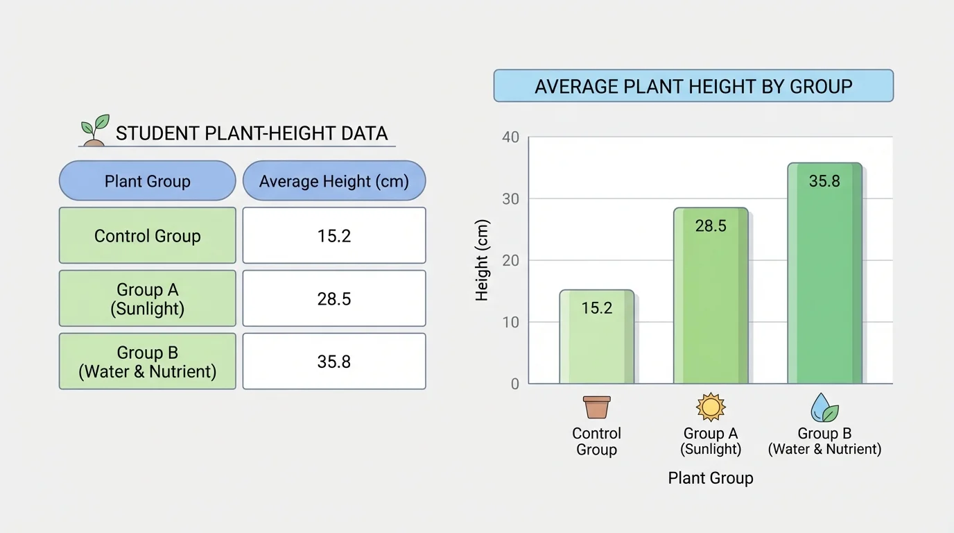
Titles matter too. A graph called Results is not very helpful. A graph called Average Plant Height After Seven Days of Growth tells the reader exactly what the data is about.
When scientists organize data, they are preparing to ask stronger questions. Which group is highest? Which one changed the fastest? Is the difference large or small? The structure of the data helps those questions become easier to answer.
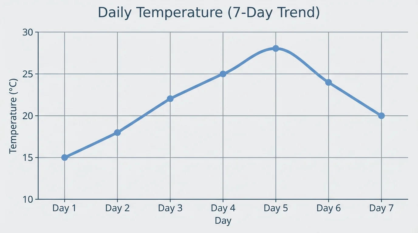
Once data is organized, the next step is to search for patterns. Patterns may show increases, decreases, cycles, or differences between groups, and [Figure 2] illustrates how a line graph makes changes over time easy to spot. Scientists pay close attention to patterns because patterns often point to explanations.
Suppose daily temperature readings are \(18, 20, 22, 25, 24, 21, 19\). A scientist can see that the temperature rises for several days and then falls. That pattern may suggest a warm front moved through the area and then passed.
Sometimes scientists compare groups. Imagine two cups of water left in different places, one in the sun and one in the shade. If the water in the sunny spot evaporates faster, the data may support the idea that more heat speeds evaporation.
Scientists also look for relationships. A relationship means that one thing changes when another thing changes. For example, if more sunlight is linked with more plant growth, that is a relationship in the data.
But scientists must be careful. A pattern does not automatically prove a cause. If two things happen together, there may be other reasons. Data provides evidence, but scientists must still reason carefully.
Patterns help scientists explain phenomena. If a pattern appears again and again, it may reveal how the natural world works. For example, if ice melts faster at higher temperatures every time it is tested, that repeated pattern supports the explanation that heat energy causes faster melting.
Another important idea is the trend. A trend is the general direction the data follows. A trend may move upward, downward, or stay fairly stable. Looking at trends is especially useful when there are many data points.
Reading a graph carefully is an important science skill. First, look at the title. Then check the labels on the axes or columns. After that, examine the scale. If the scale changes by \(1\), the graph may show detail. If it changes by \(10\), the graph may show a broader picture.
In a bar graph, compare the heights of the bars. In a line graph, follow the line from left to right. Ask questions such as: Where is the highest point? Where is the lowest point? Is there a sudden jump? Does the line stay level for a while?
In a table, look for repeated values, large differences, or numbers that do not fit the overall pattern. A value that is very different from the rest is sometimes called an outlier. An outlier may be a mistake, or it may reveal something important.
| Tool | Best Use | Example |
|---|---|---|
| Table | Recording exact values | Plant heights each day |
| Bar graph | Comparing groups | Height of plants in different light conditions |
| Line graph | Showing change over time | Temperature across a week |
Table 1. Common ways to organize data and what each one helps scientists see.
As seen earlier in [Figure 2], a line graph is especially helpful when time is involved, because the shape of the line makes a trend visible at a glance.
Now comes the most important step: using data as evidence to explain what happened. If a scientist notices that a metal spoon becomes warmer in hot soup, that is an observation. If the spoon's temperature rises from \(22^\circ\textrm{C}\) to \(48^\circ\textrm{C}\), that is data. The interpretation is that heat moved from the soup into the spoon. The phenomenon is heat transfer.
Science explanations are strongest when they connect three parts: a claim, evidence, and reasoning. The claim says what you think is happening. The evidence comes from the data. The reasoning explains why the evidence supports the claim.
Claim, evidence, and reasoning example
Question: Why did one puddle dry up faster than another?
Step 1: Make a claim
The puddle in the sunny area dried faster because sunlight warmed it more.
Step 2: Use evidence from data
The sunny puddle shrank from \(200 \textrm{ mL}\) to \(40 \textrm{ mL}\) in \(3 \textrm{ hours}\), while the shaded puddle shrank from \(200 \textrm{ mL}\) to \(130 \textrm{ mL}\).
Step 3: Add reasoning
More sunlight means more heat energy. More heat speeds evaporation, so the sunny puddle lost water faster.
This explanation uses data as evidence for the phenomenon of evaporation.
Notice that the explanation does not just repeat numbers. It uses the numbers to support an idea about how the world works.
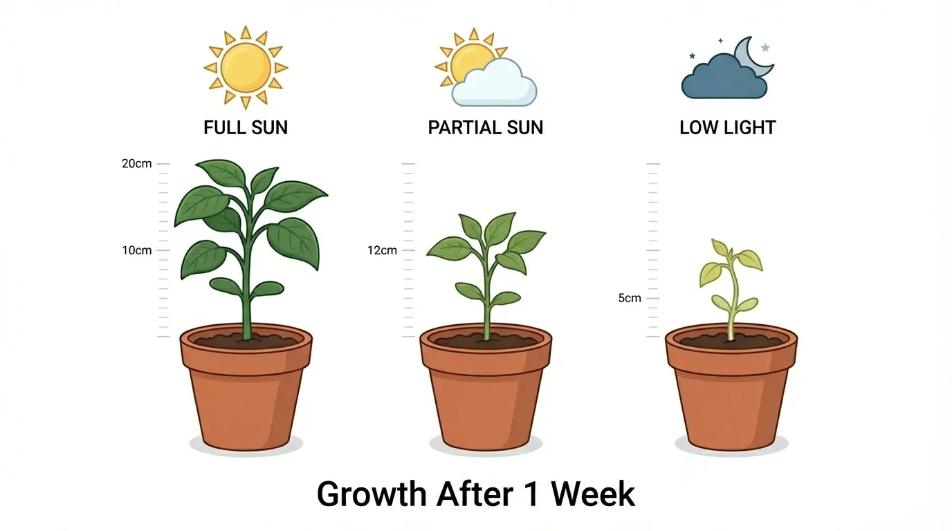
Plant growth is a useful example because many students have seen that some plants do better near windows than in dark corners. A light-and-growth investigation can provide evidence for the phenomenon that light affects plant growth.
[Figure 3] Plant growth is easier to compare when similar plants are tested under different light conditions.
Suppose three identical plants are given the same amount of water and soil, but different light conditions. After one week, their heights are measured.
| Plant Group | Light Condition | Height After 7 Days |
|---|---|---|
| A | Full sun | \(18 \textrm{ cm}\) |
| B | Partial sun | \(14 \textrm{ cm}\) |
| C | Low light | \(9 \textrm{ cm}\) |
Table 2. Plant height data showing growth under different amounts of light.
The data shows a clear pattern: more light is linked to greater plant height. Group A is tallest, Group B is in the middle, and Group C is shortest. This evidence supports the claim that light helps plants grow.
A stronger interpretation goes one step further. Plants use light to make food through photosynthesis. If a plant receives less light, it may make less food, which can limit growth. That scientific idea helps explain the pattern in the data.
Just as organized data was easier to read in [Figure 1], the plant investigation becomes more convincing when the measurements are placed in a table or graph instead of left as scattered notes.
Weather is another area where data helps explain phenomena. People may notice that summers are hotter than winters, but weather records provide evidence. If monthly average temperatures rise from winter into summer and then fall again toward winter, the data shows a yearly cycle.
For example, imagine average temperatures for six months are \(5, 8, 13, 19, 24, 28\). The upward trend suggests the season is moving toward summer. If rainfall also changes, scientists may compare both sets of data to understand droughts, storms, or growing seasons.
Meteorologists collect huge amounts of data from thermometers, satellites, balloons, and radar. A forecast depends on analyzing patterns much too large and complex to notice without organized data.
Weather data can also help explain unusual events. If one month is much hotter than the same month in past years, scientists may investigate whether a heat wave occurred. They compare current data with older records to see whether the difference is normal or unusual.
Good interpretation depends on good data. If the data is unreliable, the explanation may be weak. That is why scientists care about fair tests, careful measurement, and repeated trials.
A variable is something that can change in an experiment. In the plant example, the amount of light is a variable. If water, soil, and plant type are kept the same, then scientists can focus on how light affects growth.
Scientists often repeat trials because one result may happen by chance. If a marble rolls farther one time, that does not always mean the ramp changed. Repeating the test helps scientists see whether the pattern is consistent.
They also watch for mistakes. A ruler might be read incorrectly. A thermometer might not be placed properly. A student might record \(16\) instead of \(19\). Sometimes an outlier appears because of a measurement error, and sometimes it appears because something unusual really happened. Scientists examine it instead of ignoring it automatically.
Reliable data leads to stronger evidence. When measurements are accurate, units are consistent, and tests are repeated, scientists can trust the patterns they see. That makes their explanations of phenomena more convincing.
As seen in [Figure 3], comparing similar plants under controlled conditions makes the conclusion about light much stronger than comparing completely different plants in different soils and containers.
A strong scientific explanation is clear, supported by evidence, and connected to science ideas. It does not simply say, "This happened." It explains why the data supports that conclusion.
For example, suppose salt is spread on an icy sidewalk and the ice melts faster there than on nearby untreated ice. The data might show that the salted area becomes slushy first. A student could explain that the salt changes how water freezes and melts, so the data supports the phenomenon of faster melting on the salted surface.
Strong explanations often use phrases such as the data shows, the pattern suggests, this supports the claim, and one possible explanation is. These phrases remind us that science is based on evidence and reasoning, not guessing.
"Science is a way of thinking much more than it is a body of knowledge."
— Carl Sagan
That quote matters here because analyzing data is really about thinking carefully. It means asking what the evidence says, what it does not say, and how strongly it supports an explanation.
Data interpretation is not only for scientists in labs. Coaches study player statistics. City planners study traffic patterns. Farmers study rainfall and soil conditions. Families might compare electricity use from month to month to understand why one bill is higher than another.
Even at school, data can help explain phenomena. If a classroom plant grows poorly near an air conditioner, students can measure temperature, light, and soil moisture. Then they can use the data to explain what affected the plant.
Learning to analyze and interpret data helps people make better decisions. It trains the brain to notice patterns, ask questions, and support ideas with evidence. That skill is useful in science, but it is also useful in everyday life whenever you want to understand what is really happening.