A brilliant design can still fail if nobody understands it. Engineers have built safe machines that were ignored because their reports were confusing. Scientists have gathered strong evidence but lost trust because their graphs were misleading. In technical fields, communication is not an extra skill added at the end. It is part of the work itself. If you discover, design, test, or improve something, you also need to explain what it is, how it works, why it matters, and what the evidence shows.
Technical communication means sharing specialized information in ways that other people can use. That may involve explaining a natural phenomenon, such as why a storm grows stronger, or presenting a proposed system, such as a water filter, an app, a bridge design, or an energy device. Strong communication depends on the science or engineering being correct, but it also depends on selecting relevant evidence, judging the quality of information, and choosing the right format for the audience and purpose.
Technical communication is the clear and accurate sharing of specialized information, data, designs, or explanations so that others can understand, evaluate, and act on them.
Audience is the specific group a message is meant for. Purpose is the reason for the communication, such as informing, persuading, instructing, or reporting results.
When scientists and engineers communicate, they usually work within the practice of obtaining, evaluating, and communicating information. First, they gather information from observations, experiments, data sets, articles, interviews, or tests. Then they evaluate whether the information is trustworthy, relevant, complete, and accurate. Finally, they communicate it in forms that match the situation. A detailed lab report, a quick oral briefing, a labeled diagram, and a calculation table may all describe the same idea, but each highlights different features.
The first challenge is knowing your audience. An engineer speaking to other engineers can use more specialized terms than the same engineer speaking to a city council or a group of students. If the audience is expert, precision and detailed evidence matter most. If the audience is non-expert, the speaker or writer still needs accuracy, but must define terms, reduce unnecessary jargon, and connect ideas to familiar experiences.
The second challenge is knowing your purpose. Are you explaining a phenomenon, defending a design choice, comparing options, reporting test results, or recommending a next step? A technical explanation should not simply dump facts. It should guide the reader or listener toward a clear understanding. For example, if a team proposes a new bike helmet material, they may need to explain impact absorption, compare cost, report test data, and justify why the design is safer.
Poor technical communication can have serious consequences. Missing units can lead to design errors. Ambiguous instructions can create safety hazards. A graph with a distorted scale can make weak results look impressive. Vague claims like "the system works better" are not persuasive unless they are supported by measurable evidence, such as an increase in efficiency from \(62\%\) to \(78\%\), or a reduction in charging time from \(90\) minutes to \(55\) minutes.
One of the most famous technical communication failures involved unit confusion. In a major space mission error, one team used one measurement system while another used a different one, and the mismatch contributed to the loss of the spacecraft.
Clear communication also supports teamwork. In real projects, designers, programmers, technicians, managers, clients, and community members may all need access to the same core information in different forms. A process is more likely to be improved when its steps, constraints, and results are made visible and understandable.
A single technical idea can appear in several forms, as [Figure 1] shows. Suppose a team proposes a solar charging station for phones at school. In an oral explanation, they may describe the problem of limited charging access and explain how solar panels power USB ports during the day. In a graphical format, they may use a labeled diagram of the system. In text, they may write a proposal describing components, costs, and benefits. In mathematics, they may show estimated energy production and charging capacity.
Each format has strengths. Oral communication is useful when immediate explanation, emphasis, or question-answer interaction matters. Graphical communication helps show parts, patterns, trends, and processes at a glance. Textual communication allows precise detail, careful organization, and permanent documentation. Mathematical communication expresses relationships exactly and helps quantify performance.
No single format is enough for every situation. A speech alone may be memorable but too brief. A graph alone may show a trend but not explain why it matters. A long report may be accurate but hard to scan quickly. A formula may be exact but confusing if variables and units are not defined. Skilled communicators combine formats so each one supports the others.
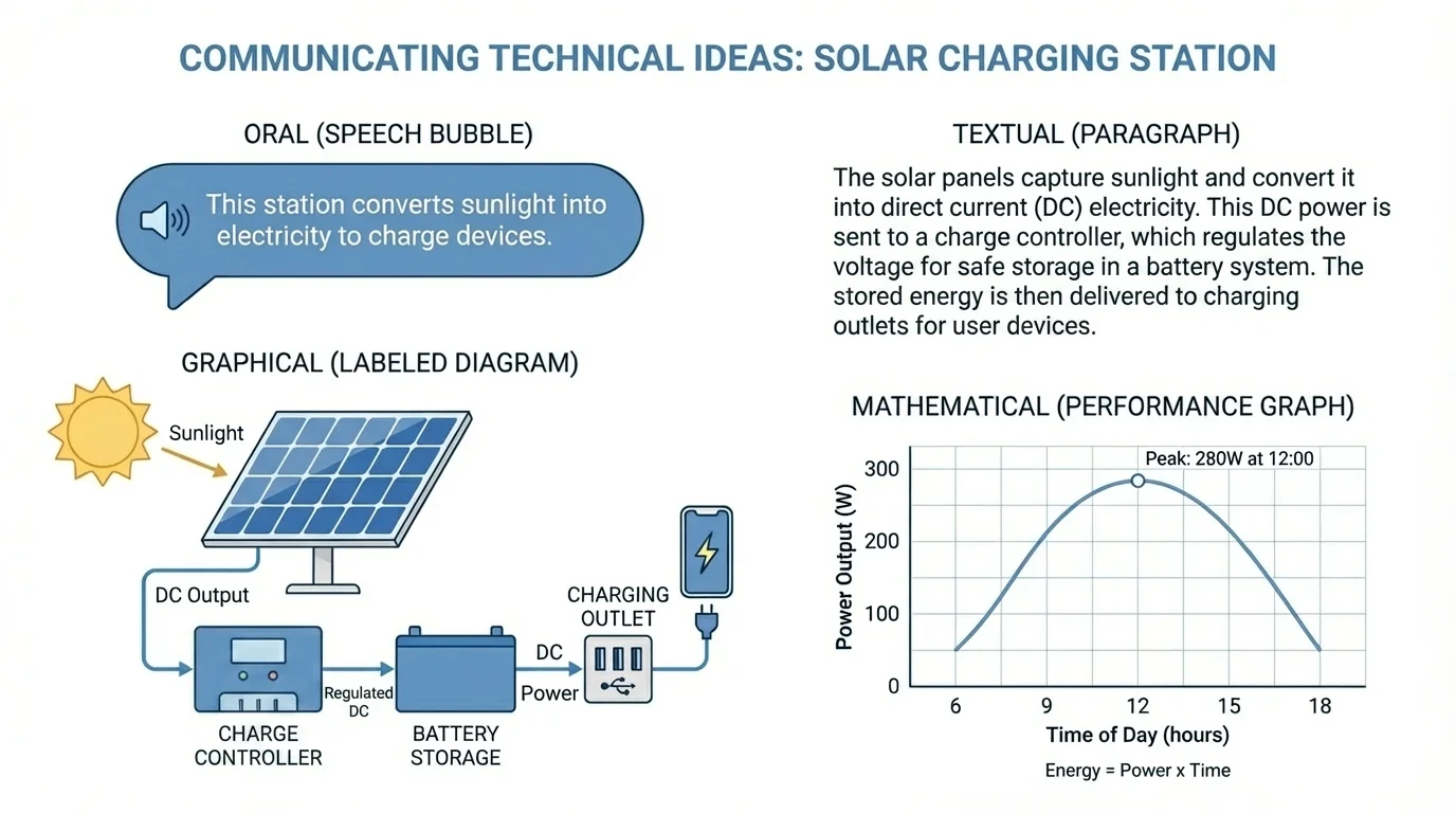
For example, a speaker might say, "The station can charge approximately \(12\) phones during peak sunlight," while a graph shows power output over time, a paragraph explains design choices, and a calculation demonstrates how that estimate was found. Later, when evaluating a proposal, the audience can compare whether the spoken claims match the written data and mathematical evidence.
Before presenting technical information, you need to know whether it is dependable. This is where evidence matters. Strong evidence is based on observation, measurement, testing, or credible research. Weak evidence relies on unsupported opinions, isolated examples, or information copied without verification.
A student preparing a presentation on air quality might gather information from sensor readings, government environmental reports, scientific articles, and local interviews. Those sources are not automatically equal. A recent peer-reviewed study usually carries more weight than an anonymous social media post. A calibrated sensor is more trustworthy than a device with unknown accuracy. Evaluating information means asking questions such as: Who produced this? How was it measured? Is it current? Is it biased? Does another reliable source support it?
Evaluating information means checking both credibility and usefulness. A source can be credible but not relevant, and relevant but unreliable. Good technical communication depends on selecting information that is both trustworthy and directly connected to the question being addressed.
Another key issue is uncertainty. Measurements are rarely perfect. In science and engineering, it is more honest to communicate limits than to pretend every value is exact. If a water filter removes between \(92\%\) and \(95\%\) of a contaminant under different conditions, reporting that range is stronger than claiming a fixed \(95\%\) every time. Communicating uncertainty does not weaken a message; it makes it more trustworthy.
It is also important to separate data from interpretation. Data might show that battery output drops as temperature decreases. Interpretation explains why that happens and what it means for design decisions. If a report mixes the two carelessly, readers may not know which claims are directly measured and which are inferred.
Visual choices strongly affect meaning, as [Figure 2] illustrates. A graph is powerful when you want to show how one variable changes with another, such as temperature over time or output current as sunlight intensity increases. A diagram is better when you need to show the parts of a system, such as wires, panels, valves, or sensors. A flowchart helps explain a sequence of actions or decisions. A table works best when exact values matter more than visual pattern.
A graph should include labeled axes, units, and a scale that does not distort the trend. A bar chart is useful for comparing categories, such as the efficiency of three turbine designs. A line graph is useful for continuous change, such as how water temperature changes across \(24\) hours. A scatter plot can reveal correlation, such as whether increased surface area is associated with increased cooling rate.
A flowchart is especially useful for a process or system with steps. For instance, a water-treatment process may involve intake, filtration, chemical treatment, testing, and distribution. The arrows in a flowchart help the viewer understand direction, order, and possible decision points more quickly than a paragraph alone.
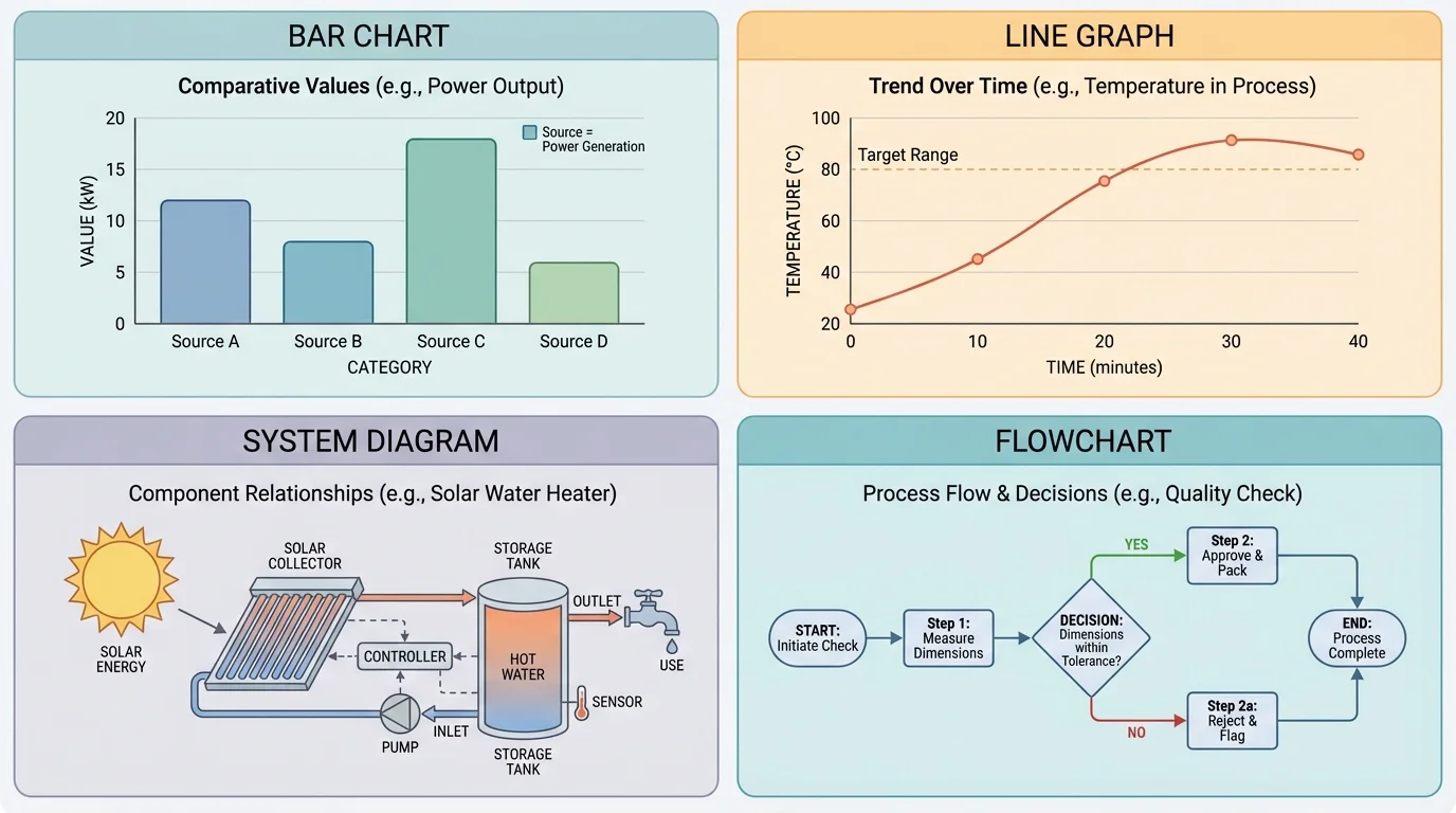
Visuals can also mislead. If a vertical axis starts at \(90\) instead of \(0\), a small difference may appear huge. If colors are inconsistent, readers may confuse categories. If labels are missing, a good graph becomes nearly useless. The same caution applies to diagrams: if parts are not labeled clearly, the audience may understand the picture but not the system.
As the comparison makes clear, choosing the wrong visual format can hide the very idea you are trying to communicate. A graph cannot easily show physical layout, and a diagram cannot easily show change over time. Matching the visual tool to the message is a technical decision, not just a design choice.
| Format | Best Use | Common Mistake |
|---|---|---|
| Bar chart | Compare categories | Using unequal bar widths or unclear labels |
| Line graph | Show change over time | Using broken scales without warning |
| Diagram | Show parts and structure | Too many unlabeled components |
| Flowchart | Show sequence or decisions | Arrows that do not clearly show direction |
| Table | Show exact values | Overloading with unnecessary data |
Table 1. Common technical communication formats, their best uses, and typical mistakes.
Technical writing is not the same as casual writing. It values precision, logical order, and evidence. A strong technical paragraph often begins with the main idea, then gives supporting details, evidence, and interpretation. If you are describing how a heat exchanger works, start with the overall function, then explain the movement of thermal energy, then provide data or design details.
Good technical writing defines specialized terms the first time they matter. For example, a constraint is a limit on a design, such as maximum cost, available space, safety requirements, or material strength. A report on a bridge model should not simply say "the design failed because of constraints." It should identify which constraints mattered and how they influenced the result.
Textual revision example
Weak sentence: "The prototype was better and worked well in tests."
Step 1: Identify vague words
Words like "better" and "worked well" do not tell the reader what changed or how success was measured.
Step 2: Replace vague words with measurable details
State the basis for comparison, such as speed, efficiency, cost, durability, or accuracy.
Step 3: Write a precise revision
"The revised prototype completed the sorting task in \(18\) seconds instead of \(31\) seconds and reduced sorting errors from \(5\) to \(1\) per trial."
The revised version is stronger because it gives evidence and a clear comparison.
Transitions matter too. Words like therefore, however, because, and in contrast help readers follow the logic. If a report says a design is cheaper but less efficient, the relationship between those ideas should be explicit. Technical communication often involves trade-offs, so logical connections must be visible.
Writers also need to separate description from recommendation. "The motor reached \(78^\textrm{C}\)" is a description. "The motor should be cooled more effectively before extended operation" is a recommendation based on that description. Mixing them carelessly can make a report sound more certain than the evidence allows.
Oral communication becomes especially important when information must be delivered efficiently. In a presentation, students may need to explain a process, defend a design choice, or answer questions from classmates, teachers, or judges. Speaking well in a technical setting does not mean sounding fancy. It means being clear, organized, and responsive.
A useful oral structure is: problem, method, evidence, conclusion. For example, "Our goal was to reduce water waste in the school garden. We tested two irrigation schedules. The data showed that watering at dawn used \(18\%\) less water while maintaining plant growth. Therefore, we recommend the dawn schedule." That sequence makes the reasoning easy to follow.
When speaking from data, the audience cannot reread your words the way they can reread a report. Important numbers, units, and comparisons should be stated slowly and connected to their meaning.
Slides or posters should support the talk, not replace it. If a slide contains too much text, the audience must choose between reading and listening. If it contains a graph, the speaker should guide the audience through it: identify the axes, state the pattern, and explain the significance. A strong presenter also anticipates likely questions. If someone asks why one design was chosen over another, the answer should refer to criteria, constraints, and evidence.
The oral format is especially useful when people need to make decisions. A team proposing a recycling system to school administrators might only have a few minutes to explain costs, expected waste reduction, and implementation steps. In that setting, the clarity of spoken explanation can determine whether the idea is taken seriously.
Mathematics makes technical communication exact. Numbers describe size, rate, change, and comparison in ways that words alone cannot. But calculations are only useful when they are explained clearly, with variables defined and units included.
A common technical relationship is efficiency. Efficiency compares useful output to total input:
\[\textrm{efficiency} = \frac{\textrm{useful output}}{\textrm{total input}} \times 100\%\]
If a device receives \(200\) joules of energy and delivers \(150\) joules as useful output, then its efficiency is \(\dfrac{150}{200} \times 100\% = 75\%\). Reporting only that the device is "efficient" is weak. Reporting that it operates at \(75\%\) efficiency is much stronger.
Worked mathematical example: estimating charging capacity
A solar panel produces an average of \(120\) watt-hours per day, and each phone charge requires about \(10\) watt-hours. Estimate how many full charges are possible per day.
Step 1: Write the relationship
Number of charges equals total energy available divided by energy per charge.
Step 2: Substitute the values
\[\textrm{charges} = \frac{120}{10} = 12\]
Step 3: Interpret the result
The station can provide about \(12\) full charges per day under the stated conditions.
This numerical result becomes more meaningful when combined with written assumptions and a diagram of the system.
Another important idea is rate, which describes how one quantity changes relative to another. If a tank fills at \(4\) liters per minute, that rate helps predict performance. In communication, rates should be expressed with units and context. A number without units can be useless or misleading.
Mathematical communication also includes comparing designs. If Prototype A costs \(\$180\) and lasts \(300\) hours, while Prototype B costs \(\$240\) and lasts \(500\) hours, you might calculate cost per hour. For A, \(\dfrac{180}{300} = 0.60\) dollars per hour. For B, \(\dfrac{240}{500} = 0.48\) dollars per hour. Even though B costs more at first, it may be a better long-term value. The math supports the recommendation.
As with the multi-format example in [Figure 1], mathematical statements are strongest when linked to a spoken or written explanation. A formula does not interpret itself. The communicator must explain what was measured, why the formula applies, and what the result means for the system or phenomenon being studied.
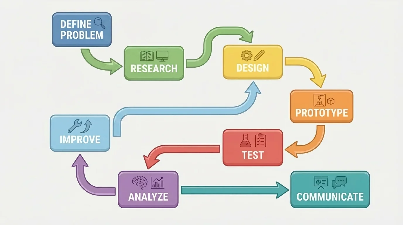
Engineering communication often focuses not just on what a system is, but on how it was developed. Development is usually iterative, as [Figure 3] shows. A team defines a problem, researches it, proposes solutions, builds a prototype, tests it, analyzes results, and then improves the design. This cycle may repeat many times.
When reporting development, communicators should identify criteria and constraints. Criteria are the goals a successful design should meet, such as charging speed, safety, ease of use, or low environmental impact. Constraints are the limits, such as budget, available materials, size, or time. Good communication explains how the final design balances these factors rather than pretending the "best" solution has no trade-offs.
A performance report should include what was tested, how it was tested, and what the results showed. For example, if an air-filter prototype removed \(83\%\) of particles in one trial and \(86\%\) in another, the report should state the test conditions and discuss variation. If one version was lighter but less durable, both results matter. Technical decisions rarely depend on one number alone.
Communication about systems also benefits from cause-and-effect explanations. A writer should not merely state that Version B performed better than Version A. They should explain why, perhaps because a wider intake increased airflow or improved fluid flow. This helps others evaluate whether the improvement is likely to remain effective under new conditions.
Later discussions of redesign often return to this cycle. Testing is not the endpoint; it is a source of information for the next revision. In that sense, communication is part of development itself, because design improvements depend on accurately sharing test results and interpretations.
One common mistake is using too much jargon. Specialized vocabulary can be useful among experts, but it becomes a barrier if the audience does not know the terms. Good communicators use necessary technical language, but define it when needed and avoid unnecessary complexity.
Another mistake is making claims without support. Saying "our design is more sustainable" means little unless the speaker explains whether that refers to energy use, material choice, waste reduction, or lifespan. Strong claims are tied to evidence, comparison, and criteria.
Missing units are another major problem. Saying a machine produces \(50\) is incomplete. Produces \(50\) what? Watts, newtons, liters per hour, or decibels? Units help define meaning. A number alone cannot communicate technical information accurately.
"What gets measured gets managed."
— Common engineering and management principle
Finally, many communicators choose the wrong format. A paragraph that tries to describe a complicated circuit may be less effective than a labeled diagram. A list of values that hides a trend may be clearer as a graph. A vague spoken claim may become convincing when paired with a calculation and a chart. Choosing format is part of the reasoning process.
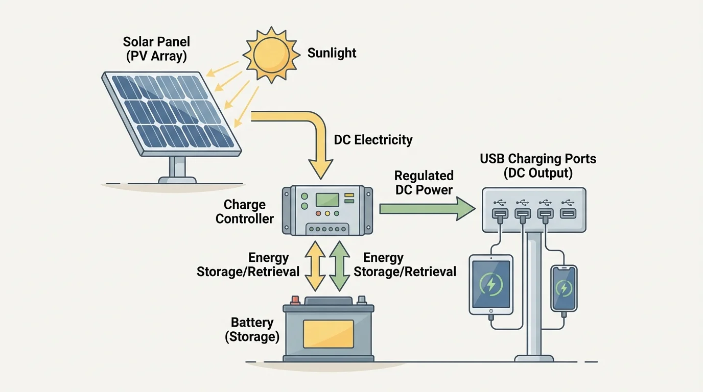
Consider a team proposing a small solar charging station for student devices. The system includes a panel, battery, charge controller, and USB outlets. To communicate this proposal well, the team should use multiple formats instead of relying on just one.
[Figure 4] In a written proposal, the team explains the problem: students often need phone power during long school days, and grid-powered charging increases electricity use. The proposal describes the system components, safety features, expected daily output, and installation location. It also explains criteria such as usability and energy independence, along with constraints such as budget and limited roof or outdoor space.
In a graphical format, a labeled system diagram helps viewers quickly understand how energy moves from sunlight to panel to battery to charging ports. A small line graph can show estimated output at different times of day. A table can compare projected energy production in sunny and cloudy conditions.
In an oral presentation, the team summarizes the idea efficiently: problem, solution, evidence, and recommendation. They might say that if the panel generates \(120\) watt-hours per day and each full charge uses \(10\) watt-hours, the station can supply about \(12\) charges daily. They should also mention limits, such as lower output in poor weather.
In mathematical form, they can support claims with calculations. If the battery stores \(240\) watt-hours and each phone charge needs \(10\) watt-hours, then maximum stored charging capacity is \(\dfrac{240}{10} = 24\) charges, assuming ideal conditions. If actual transfer efficiency is \(80\%\), then usable stored energy is \(240 \times 0.80 = 192\) watt-hours, which supports about \(\dfrac{192}{10} = 19.2\), or approximately \(19\), charges. This is the kind of detail that makes a proposal realistic rather than promotional.
The same system can be revisited using earlier ideas from [Figure 2] and [Figure 3]. The diagram explains structure, the graph shows variation in output, and the design-cycle flowchart reminds us that field testing may lead to revisions. Technical communication succeeds when all these forms work together to help people understand, evaluate, and decide.